|
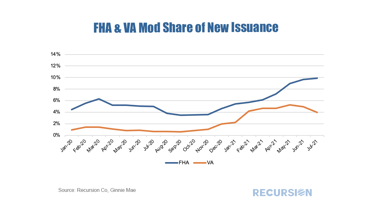
As we approach year-end and the beginning of the process of phasing out forbearance programs, the natural question market participants are asking is which indicators should they be watching to gain a sense of the mortgage landscape in 2022. Along these lines, there is a significant difference between the Ginnie Mae programs and the GSE’s. In particular, for conforming loans, it is the Agencies themselves that buy nonperforming loans out of pools, while for FHA and VA, this function is performed by servicers. As the timeframe for buyouts on the part of the GSE’s was extended to 24 months earlier this year, we won’t see much activity prior to April 2022 on this front[1]. So in this post, we focus on the Ginnie Mae programs. As we have written previously, it is challenging to follow the path of a loan once it has been purchased out of a pool. At the aggregate level, we can view the activity of individual lenders using the FHA Neighborhood Watch data[2]. In terms of the process, a nonperforming loan is bought out of a pool, and one of three actions can be taken. First, the borrower can be taken into foreclosure. Second, the borrower can become current and roll the unpaid balance into a second lien, in a process known as a partial claim. Third, the borrower can accept a loan modification. In terms of the scale of buyouts, after an early spurt of activity in 2020 on the part of some parties, notably banks, the involuntary prepayment rate, measured by CDR(constant default rate), has settled down in recent months. FHA nonbank servicers have been more active in this space than other categories over the past year. As forbearance plans begin to expire towards the end of the year, these numbers may start to rise. 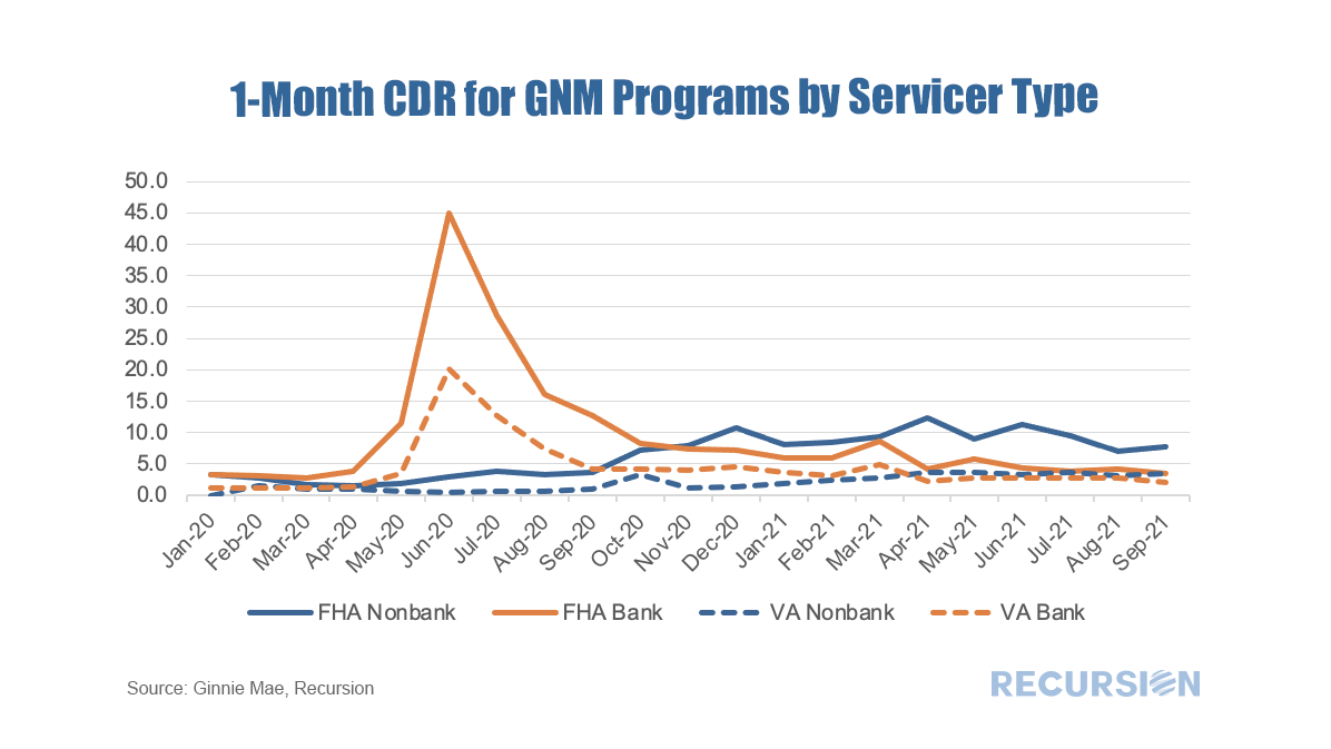 Received wisdom in the mortgage market holds that distress in the mortgage market eases as the labor market improves. While there is certainly some justification for this view, in fact there are many factors that drive performance so the direct correlation with the jobs market does not always hold.  In a recent post[1] we looked at the evolution of the FHA purchase mortgage market share broken down between areas with a high percentage of Low-Moderate Income (LMI) households and those without. While the overall FHA share has generally declined since the onset of the pandemic, its share has held up in areas with a preponderance of LMI households. There are many factors behind these trends, but a natural consideration is underwriting standards. To examine this factor, we use the Recursion Matched Dataset[2], where we create a large sample of loans with characteristics from both HMDA and the Agency disclosure data. A very high share of mortgages can be matched using our proprietary algorithm over the years 2018-2020. The coverage ratio from the Matched Dataset is provided in a previous post[3]. We proceed by looking at three major underwriting characteristics for LMI and non-LMI areas for FHA and the GSE’s: Credit Score (CS), Loan-to-Value (LTV) and Debt-to-Income (DTI), Most interesting is Credit Scores: 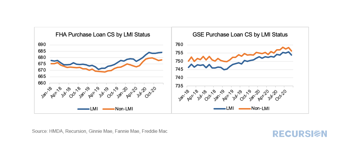 In a recent post[1], we looked at the declining FHA share of the purchase mortgage market relative to the GSE’s across a variety of price points. Another way to look at this question is by a geographic breakdown focusing on those census tracts with a Low-Moderate Income (no greater than 80% of area median income) population greater than 51% (we will call these LMI areas)[2]. To address this issue, we utilize the HMDA dataset, and then apply the LMI information to compute shares of originated purchase loans delivered to FHA vs GSE. This is done on both a loan count and loan balance basis. 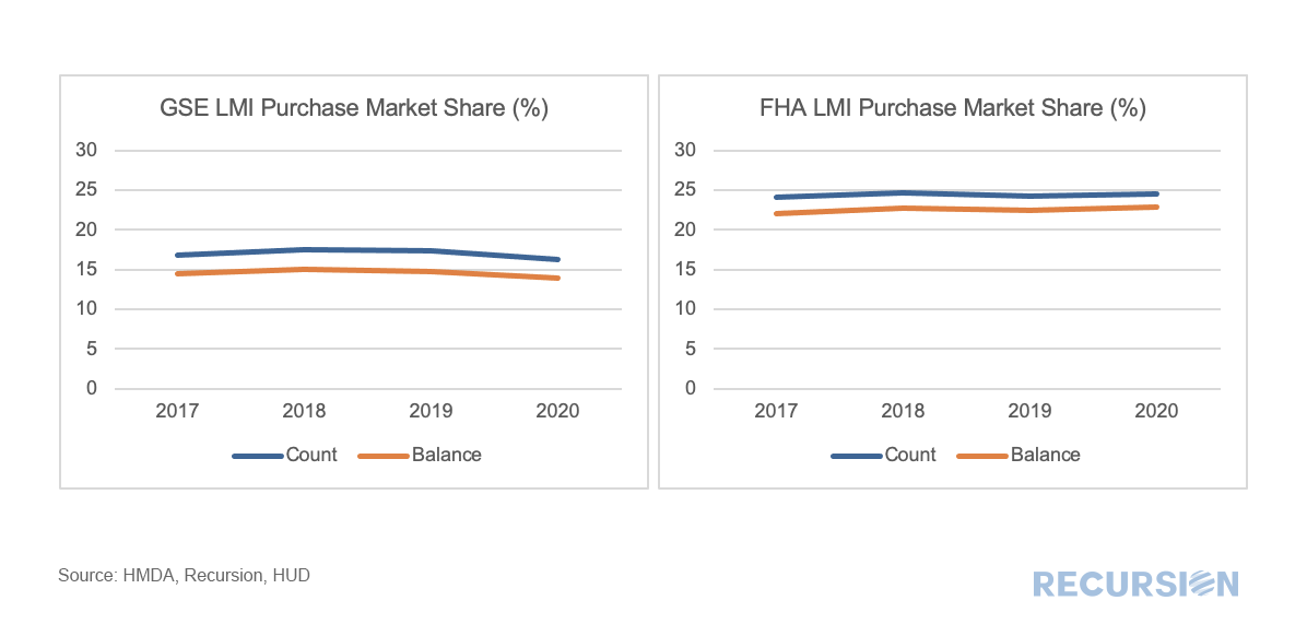 One of the many recurring themes of these posts is that the shock of the Covid-19 Pandemic and subsequent policy response has resulted in structural changes in behavior that cause loan performance metrics to shift compared to the pre-crisis world. An interesting example of this can be found in the performance of modified loans in Ginnie Mae programs. Modified loans in these programs are those that have been purchased out of pools by servicers that are past due that subsequently have features such as rate and term adjusted in order to bring households back to a current status. These are then often resecuritized into a new GNM pool.
 The recent unprecedented surge in home prices to a record 18% jump on a year-year basis as measured by the FHFA purchase-only index brings affordability front and center to the current housing policy debates. In May 2021, indexed home prices stood 15.5% above indexed aggregate earned income, a bit less than half of the peak house price overvaluation of 29.0% reached in December 2005, just before the onset of the Global Financial Crisis. 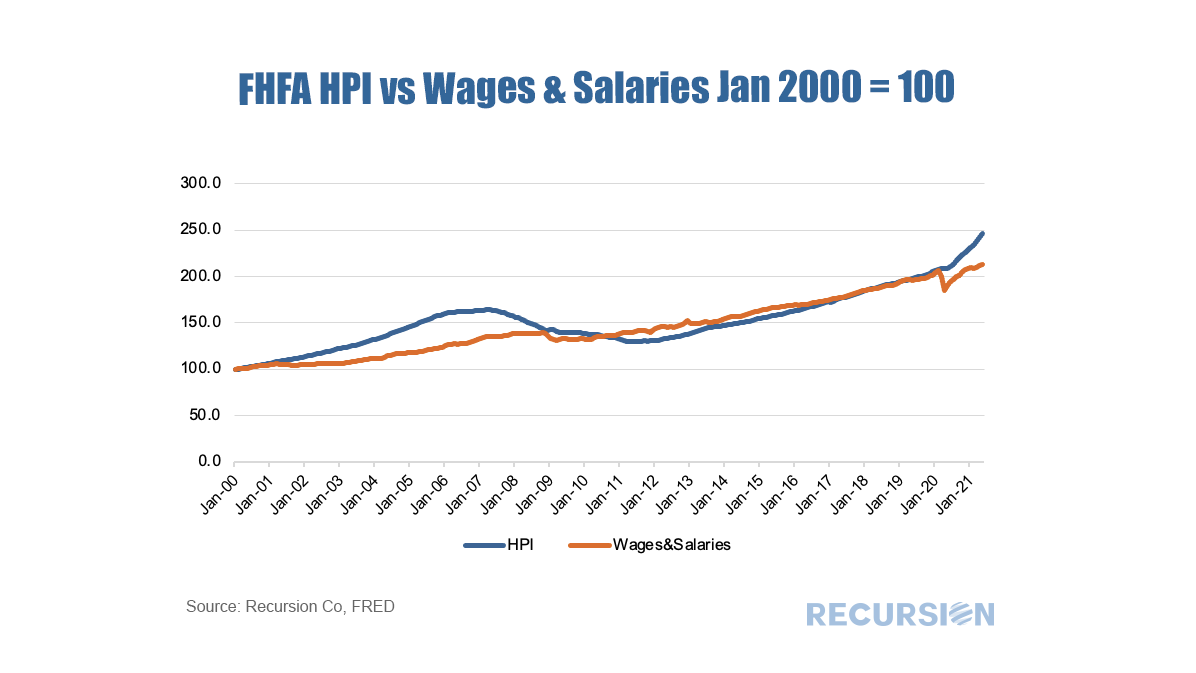 The topic of affordability is very broad, and will be the subject of much further commentary, but in this post we look briefly at this topic through the distribution of the purchase mortgage market across securitization agencies, notably FHA and the GSE’s. Looking at the distribution between the GSEs and FHA is informative in this issue because the FHA program is aimed at low-income borrowers. According to 2020 HMDA data, the weighted average household income for FHA borrowers of purchase mortgages was $85K while for those in conforming mortgages the figure was $228K. Since the onset of the Covid-19 pandemic in early 2020, the share of FHA purchase mortgages of the total[1] delivered to agency pools as been in general decline, on both a loan count and outstanding balance basis: 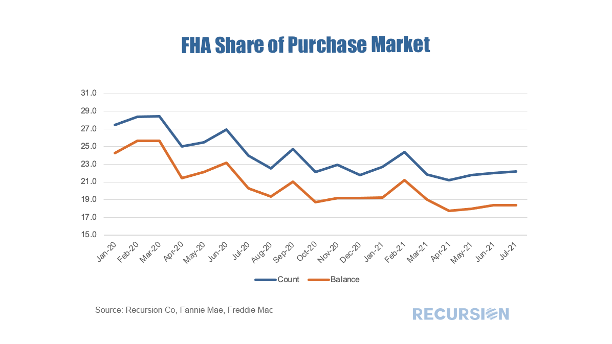 With a base consisting of relatively lower-income borrowers, it makes sense that the borrowers in this program are struggling to qualify for loans in a skyrocketing market. To check this out, we calculate the change in the distribution of loans between FHA and the GSE programs by original loan sizes: 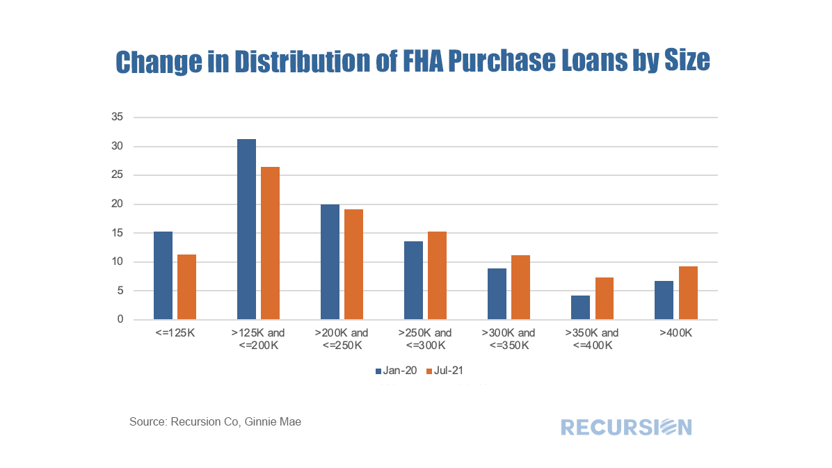 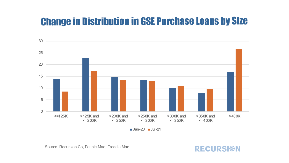 Intuitively, larger loans comprise a greater share of the distribution of purchase loans in both programs between January 2020 and July 2021. Over this period, FHA lost a bit over 5% in market share to the GSE’s in this category. The change in share by loan size bucket and the contribution of each of these to the total loss in share is given below:  In fact, it turns out that about three quarters of the loss in FHA’s purchase market share comes from losses in loan sizes less than $250,000. Further analysis is needed to look at the fundamental and structural factors that are behind this result. [1] In this case we view the total as FHA + GSE
Credit provision is one of the great areas of concern addressed by the New Housing Policy. In a previous post[1], we mentioned that we have integrated HUD LMI Neighborhood information with our tools. We can view aggregate credit creation through Cohort Analyzer, and its composition through HMDA Analyzer. 2020 marked an unprecedented year for mortgage production as the pandemic sparked aggressive moves by the Federal Reserve driving mortgage rates to record lows, coupled with a flight of households away from density towards more sparsely populated areas. Trends in the major programs by loan count can be seen here: 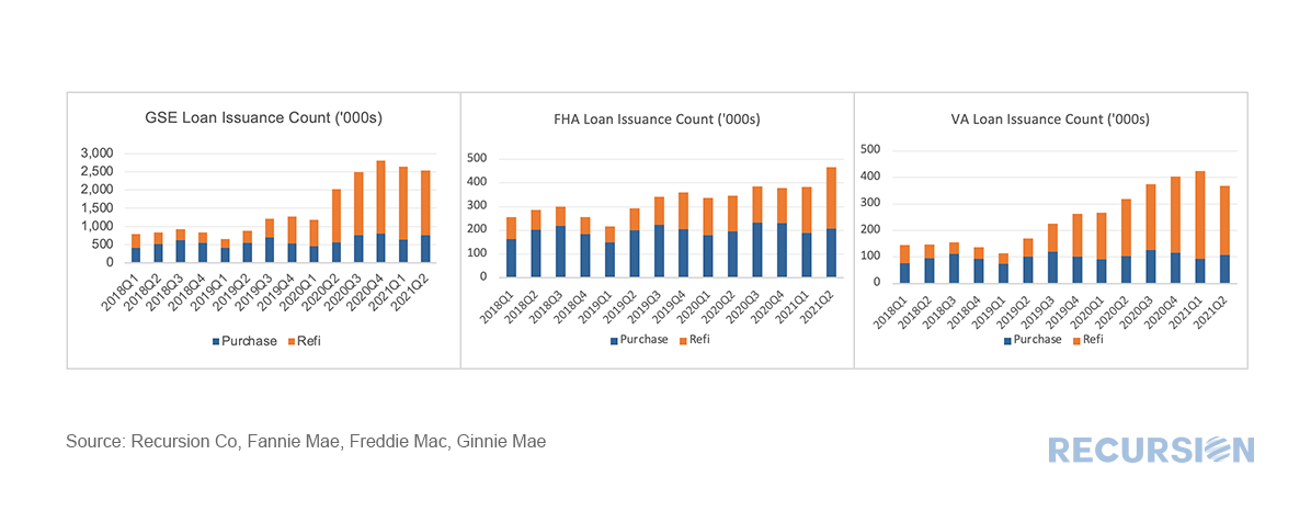 *This chart can be duplicated using the above two queries
Our proprietary matching algorithm continues to chug along and our match rates between the Agency loan tapes and HMDA continue to improve. Here is an up-to-date summary table: 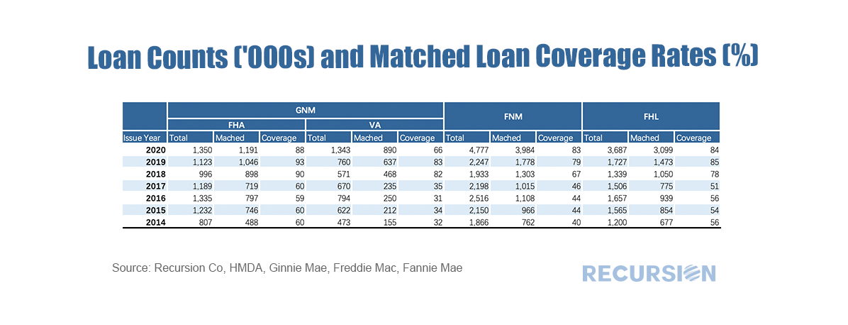 |
Archives
February 2024
Tags
All
|
 RSS Feed
RECURSION |
|

Copyright © 2022 Recursion, Co. All rights reserved.