|
In a recent post, we summarized the main market indicators from 2023 HMDA[1]. Besides offering a wider view of the mortgage market than contained in the Agency disclosures, HMDA contains a wealth of information about borrower characteristics, harking back to its original purpose of ensuring credit availability across populations. This note provides a look at some of the most-followed characteristics. We start with the race of the borrower. This type of analysis is rather nuanced as HMDA allows for information for up to two borrowers per loan file, with demographic information available for both. The chart below shows the distribution of new conventional and FHA mortgages by the race of the first race category reported by the first borrower only. 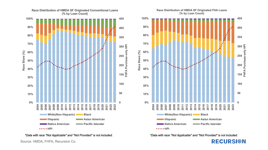 A few salient points can be immediately inferred. First, we can see that the minority share of mortgage recipients has risen steadily over the past 14 years for both loan types. 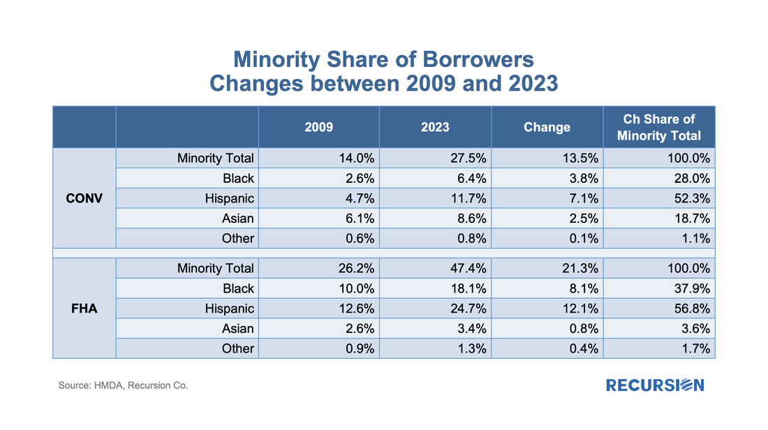 FHA continues to have a higher minority share than conventional, with minority borrowers accounting for almost half (47%) of new loans last year. That said, the share of minority borrowers obtaining conventional loans almost doubled over the 2009-2023 period to 28%, slightly below the 30% peak attained in 2006. In terms of breakdowns by race, the increase in the share of loans going to Hispanic borrowers led minority in both the conforming and FHA markets. Asian borrowers remain more significant to conventional than to FHA. There are many factors that account for these trends, including population growth in each category, policy measures taken to support minority ownership, and overall market conditions. It’s interesting to note that there is a distinct correlation between minority share and house prices in both programs. In the mid-2000, this ended badly as a disproportionate share of minority borrowers were trapped in toxic loans that led to foreclosures when the market collapsed. These concerns do not automatically carry over to the present as credit conditions are much more conservative, and policy is designed to keep distressed borrowers in their homes to the greatest extent possible. Next, we turn to gender. Here is the share of two-borrower loans where the lead borrower identifies as female: 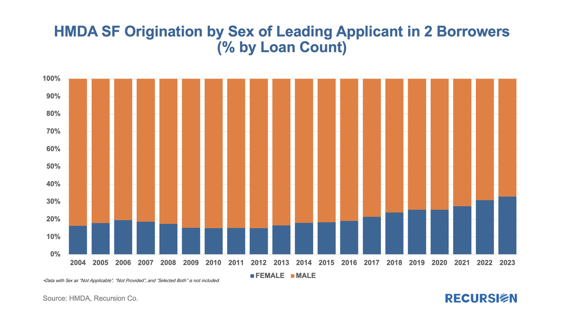 In 2023, the female share rose for the 10th time in 11 years, more than doubling from 14.9% in 2012 to 32.9% last year. HMDA also contains borrower income information, but a detailed analysis awaits the arrival of MSA-level median income data from HUD, which should be out sometime mid-year about when the final version of 2023 HMDA is released. For now, we can look at the distribution of loans by income bucket for the past three years: 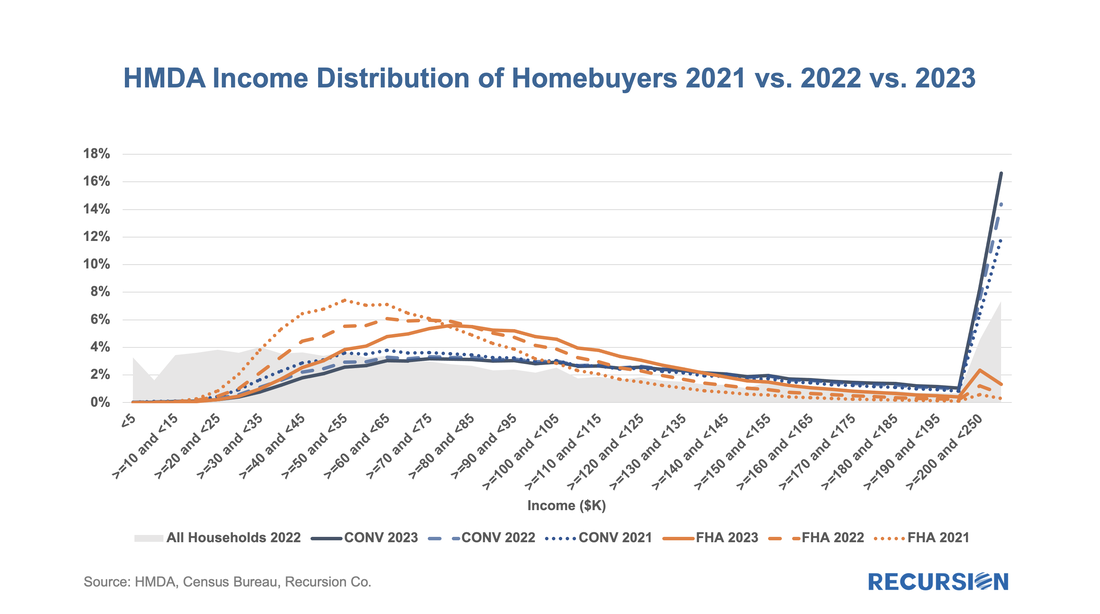 For both conventional and FHA loans, we have witnessed an increase in the weight of the distribution at the right tail, at the expense of the hump in middle-income brackets. This is particularly true for conforming loans where the share of incomes in the greater than or equal to $250 bucket jumped from 11.9% in 2021 to 16.6% in 2023. In the next blog, we will look at manufactured housing, a topic receiving increased policy scrutiny in the current era of unaffordable housing. This rich and robust dataset can accomplish much more. Feel free to contact us with specific questions. The preliminary HMDA data came out last week, and we have it fully processed and available on our Recursion HMDA Analyzer. While always notable, this release has been particularly eagerly awaited as it represents the first complete view of market conditions in “Mortgage Winter”, the extraordinary period of sustained high house prices and mortgage rates. Not surprisingly, volumes are down compared to 2022, more so for balances than loan counts: 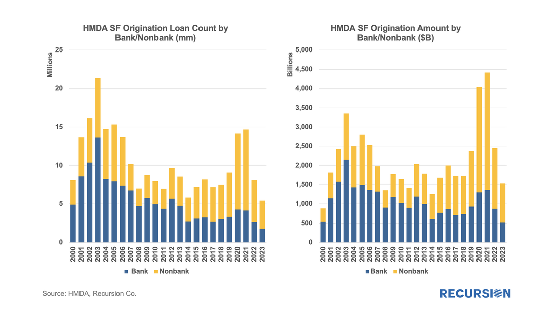 In a previous note, we looked at mortgage trends derived from the recent release of 2022 HMDA data[1]. Of course, HMDA is a prime data source for analysts and policymakers who seek to understand how social and economic trends interact. The most discussed issue is the distribution of originations by race. Below find a bar chart for the share of originations by race annually from 2004-2022 by loan count:
In a recent post, we discussed the attributes of manufactured housing data that came with the final 2021 HMDA release in July[1], which were not available in the preliminary release. Another important data point from this final release is the conforming flag, identifying which loans satisfy the requirements for delivery to Fannie Mae and Freddie Mac. Obviously, any loan sold to a GSE is conforming, so its main use is to enable analysts to examine these loans which are held on bank balance sheets. The lag between the preliminary and final releases of HMDA data can be four months or longer, so it would be useful to be able to identify these loans right after the preliminary release. One way to approach this is to flag non-government loans with balances above the conforming limits as “jumbo”. How does Recursion’s “Jumbo” flag compared with HMDA’s Conforming flag? If the information is perfect, “Jumbo” loans should be all the loans that are not “Conforming”. However, the exact original balance of a mortgage is not provided by HMDA to protect privacy. For those loans close to the conforming boundary, our program can misjudge which category to assign. Given all that, going back to 2018, there is still a very strong negative connection between the two measures:  While the Fed has clearly been the dominant player in the MBS market for the last 13 ½ years, the consistent biggest holders of MBS have been the banks. When the Federal Reserve launched its QE program in late 2008, banks held about 16% of the outstanding balance at the time, and that share has more than doubled as of Q1 2022 to stand at about one-third of the total. In a recent blog, we dug into the details behind international investor behavior with an ancillary dataset[1], for the banks, we look for guidance from the Call Reports[2]. The Call Reports provide details on portfolio holdings of individual banks across financial asset categories (e.g., equities and bonds) for both loans and securities. For the purposes of this note, we just look at securities. What makes bank behavior so challenging to assess is that various types of policy actions have profound impacts on their investment decisions. To begin, we look at the share of residential agency MBS out of total bank assets, including both pass-through securities and CMOs: 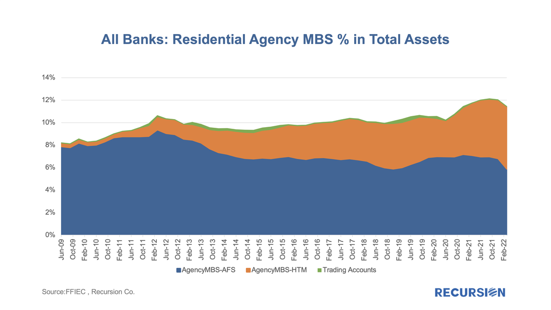 In a recent post, we posed the question: as the Fed’s portfolio shrinks, who will buy[1]? In this report, we dig a bit deeper and look at the differential market impacts based on whether the loans on the balance sheet roll off (as in, for example, a refinance transaction) or are sold off. In the first case, we assume that a mortgage in a pool the Fed holds is extinguished, and a new mortgage is created through a refinance transaction, or via a home sale followed by the purchase of a new home financed by a new purchase mortgage, or through a buyout that generates a new modified loan. This case describes the situation described in the earlier post: a mortgage on the Fed’s balance sheet disappears, and some other investor has to pick up the new loan. The question here is how much higher the yield on the new pools has to be to attract sufficient demand from private investors. These new loans tend to have characteristics that investors find attractive, including a coupon which is near the most liquid part of the market (the current coupon). The second case is quite different. In this instance, the question is how much higher the yield has to be (lower price) for the existing mortgages being sold to find buyers, not for a new mortgage with the most desirable characteristics. In this case, it’s not just a matter of who has the capacity to increase their holdings, but how much additional yield investors will be required for characteristics that are less than pristine. These are challenging issues that we can’t offer precise solutions to, but one way to approach the issue is to see how different the Fed’s portfolio looks from those held in the private sector. To conduct this exercise, we look at two characteristics. The first is the coupon distribution of what the Fed holds vs. the portfolios held by private investors. This rather technical exercise can be conducted by supplementing the data provided in the Agency disclosures contained in our Pool-level Analyzer with the central bank’s holdings provided by the New York Fed[2]. In fact, the distinction is quite notable for 30-year fixed-rate mortgage pools: 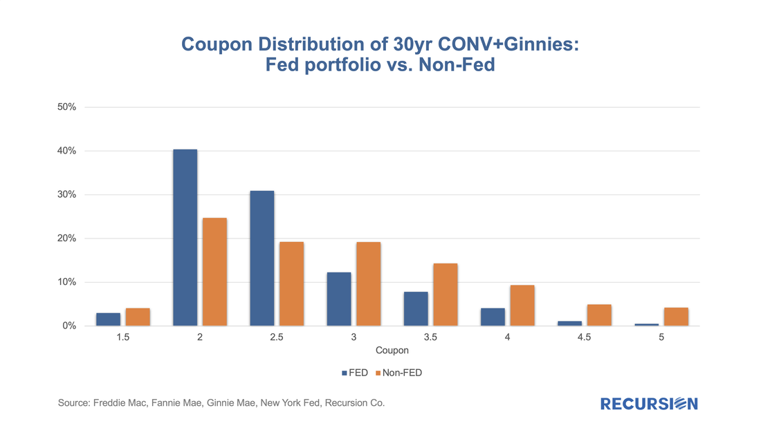 In a recent post[1], we discussed findings obtained with the recent release of 2021 HMDA data. Among other things, we looked at the share of mortgage originations by income group and product type. In this note, we look at the difference in lending patterns between the banks and nonbanks. The incentive behind this approach is policy driven. There is a long history of measures taken to encourage lenders and builders to foster economic development in low-income areas via the housing market. For example, the Community Reinvestment Act (CRA) stipulates that a bank’s performance with regards to compliance of their regulatory requirements depends in part on: “the geographic distribution of loans—that is, the proportion of the bank's total loans made within its assessment area; how these loans are distributed among low-, moderate-, middle-, and upper income locations[2]” To assess this issue, we assign a flag to each of the census tracts designated by HUD as having a greater than 51% share of households with incomes in the Low-to-Moderate (LMI) range in the larger MSA the tract is part of[3], which are called LMI area by HUD, or “low income” tracts by FHFA. Below find a chart of the 10-year trend in the share of loans originated in this category by institution type for conventional and FHA loans: 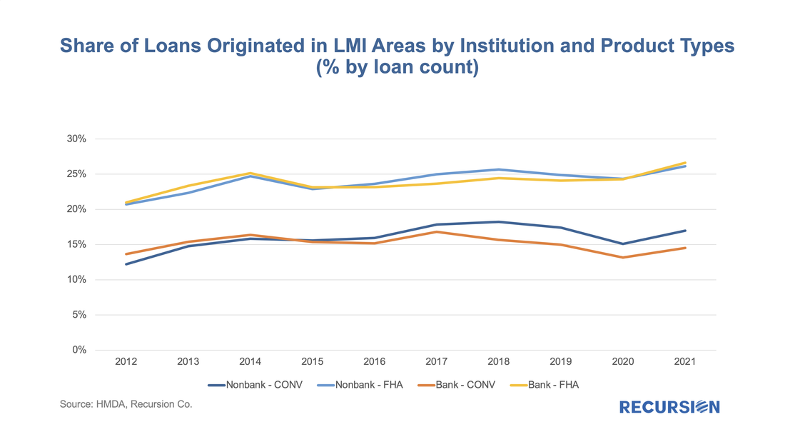 In a recent post, we discussed the utility of secondary market indicators to track the progression of loans that are coming out of forbearance in Government programs[1]. This short note looks at this progression in the conforming loan market. For the Ginnie Mae programs, issuers may buy loans out of pools after they are delinquent more than 90 days and begin a workout process that culminates in one of the options, including loan modification. The situation is quite a bit different for Fannie Mae and Freddie Mac. The main distinction is that on January 1, 2021, the GSEs extended their timeline for buying loans out of pools to 24 consecutive months of missed payments[2]. As the Covid-19 pandemic began in March 2020, we expect to see buyouts being extended as much as to April and May this year. However, we can obtain a view on future loan modifications through the trial mod flag in the borrower assistance plan field in the monthly disclosures the GSEs started to release in March, 2021. In order to obtain a permanent modification, borrowers must first successfully complete a three-month trial modification plan[3]. Below find the progression in the number of loans in such plans since March 2021: 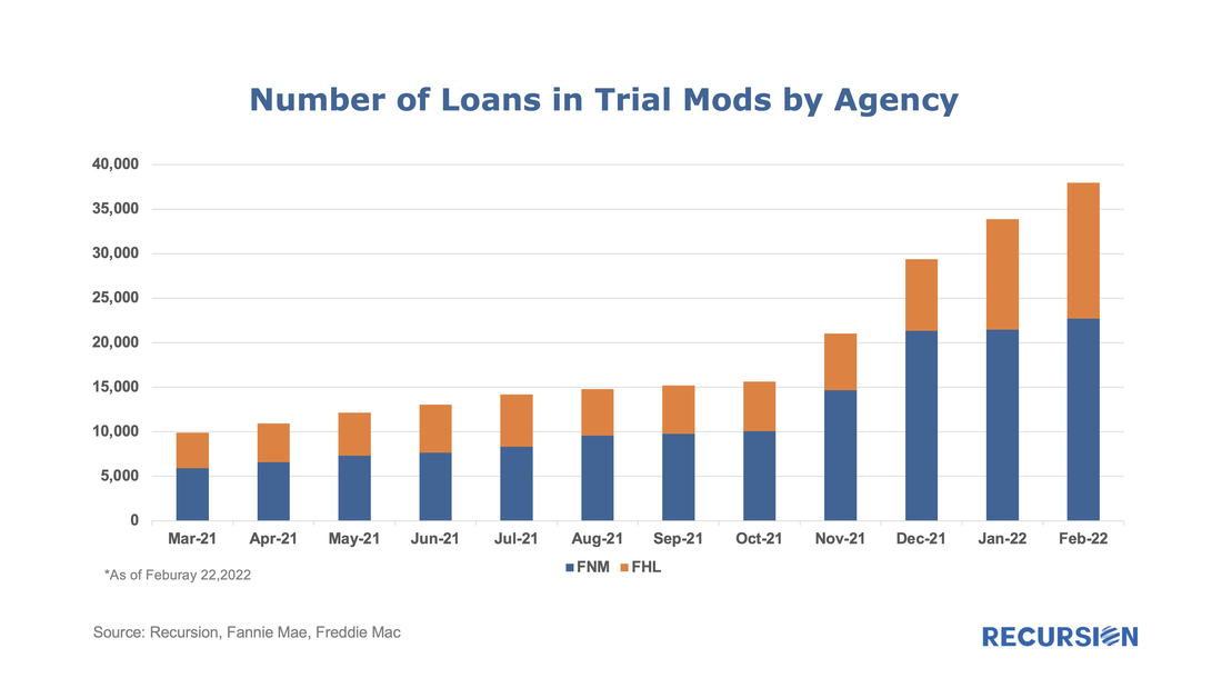 |
Archives
July 2024
Tags
All
|
 RSS Feed
RECURSION |
|

Copyright © 2022 Recursion, Co. All rights reserved.