|
Credit provision is one of the great areas of concern addressed by the New Housing Policy. In a previous post[1], we mentioned that we have integrated HUD LMI Neighborhood information with our tools. We can view aggregate credit creation through Cohort Analyzer, and its composition through HMDA Analyzer. 2020 marked an unprecedented year for mortgage production as the pandemic sparked aggressive moves by the Federal Reserve driving mortgage rates to record lows, coupled with a flight of households away from density towards more sparsely populated areas. Trends in the major programs by loan count can be seen here: 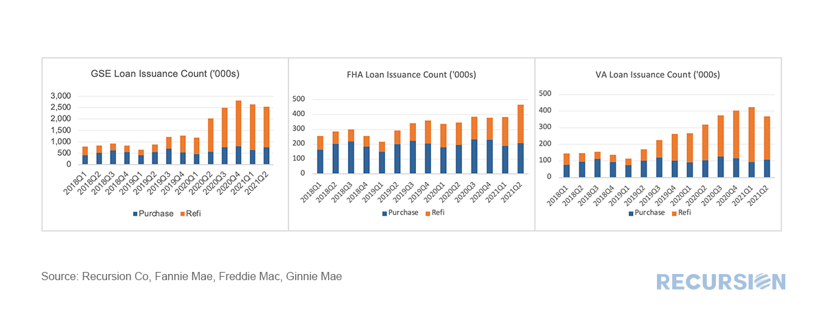 *This chart can be duplicated using the above two queries
As we accumulate more data at a fine local level, the opportunities to evaluate policies derived from insights into lender, borrower and supervisor behavior grow massively. Our recent post looking at the potential impact of FHFA’s new rate mod policy[1] is our most recent example of the application of digital tools in the policy space, but as noted previously[2], the new policy framework is designed to focus on wealth creation and housing sustainability at the local level. To look at this issue, we need to have data at hand that tells us which local areas have a preponderance of low-income borrowers on which we can overlay the HMDA data set, which reports census tract level indicators related to the policy issue at hand. It turns out that the income data can be found in the American Community Survey (ACS)[3]. A key facet of this survey is information regarding the share of every census tract where low and moderate income (LMI) people comprise less than or equal to 51% of the total population. This data is available through the HUD Exchange[4]. With that, we now have a robust tool for analysis. An immediate challenge in this regard is to come up with specific queries out of the myriad of possibilities that demonstrate their power. Below finds a chart that provides a big-picture view of lender behavior in LMI neighborhoods broken down between banks and nonbanks[5]. Specifically, we look at the trend in purchases from third-party originators of both FHA and conventional loans: 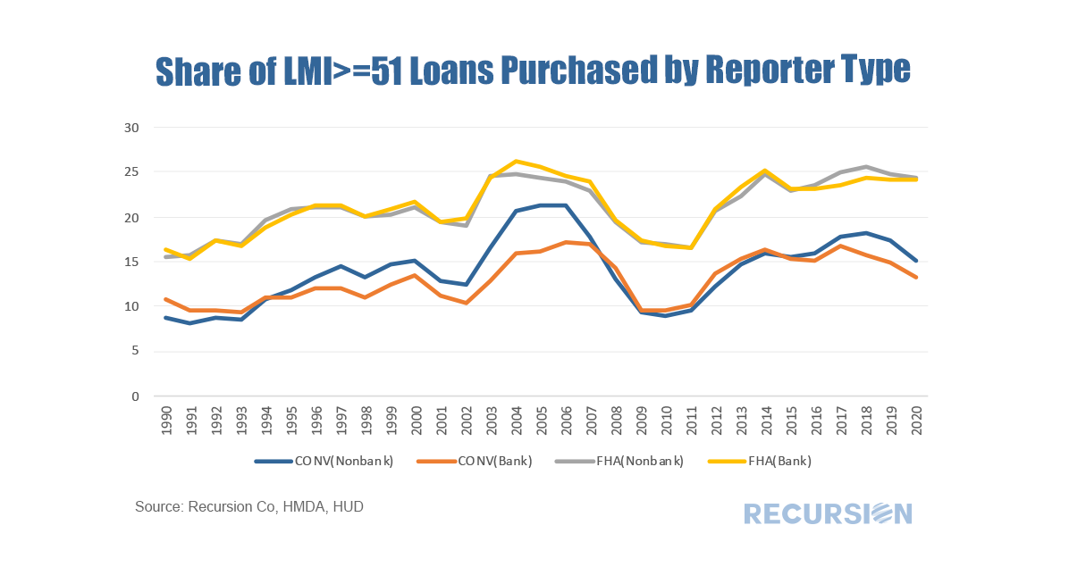 Assigning letters to economic recoveries (“V”, “L”, “U” etc.) has become a standard part of the economist’s toolkit for expressing a view on the nature of a particular forecast. The Covid-19 crisis has added a new letter to the lexicon, “K”. In a “K-shaped” recovery, some segment of the population experiences relatively strong growth, while others are left behind. Since housing tenure is an essential determinant of the distribution of household wealth, it is not surprising that we can clearly see this shape in the relative trends in house prices versus rents: 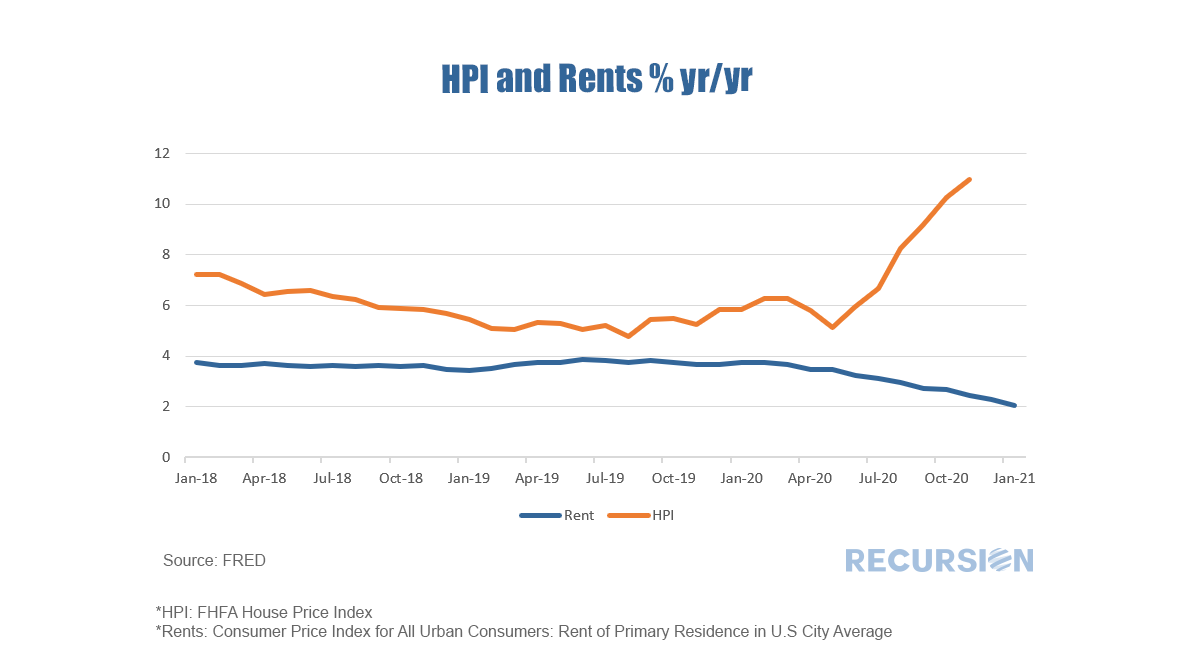 In a recent post we noted the recent striking rise in the GSE refinance share and commented that the rate of this activity in GNM programs, while still rising, has lagged[1]. This seems to be related to the tendency of capacity constrained lenders to provide credit to the highest quality borrowers, and to a looming 0.5% fee hike on GSE refinance deliveries scheduled for December 1. Focusing on FHA alone, the share of refinance loans compared to those delivered to the GSE’s has plummeted in recent months: 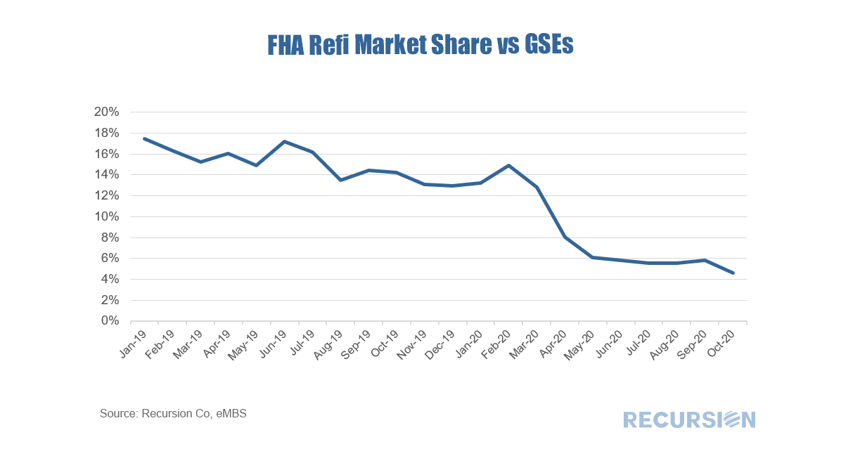 |
Archives
February 2024
Tags
All
|
 RSS Feed
RECURSION |
|

Copyright © 2022 Recursion, Co. All rights reserved.