|
The secondary mortgage market is generally focused on mortgage servicers. These institutions bear substantial risk, and their strategies regarding prepayments and foreclosures impact borrower welfare and investor returns. Yet they are not the whole picture. A buyer of a mortgage pool owns a collection of loans serviced by a variety of financial institutions. However, there are borrower characteristics impacting loan performance that are out of the control of the servicer, notably the strength of underwriting beyond what is captured in disclosed statistics such as credit scores. The originators matter. The issue we face is that loan-level data disclosed by the Agencies does not, in any case, correspond precisely to the notion of “originator” for either the GSEs or FHA besides servicers. In the case of FHA, we see the entities that pool loans to sell in accordance with Ginnie Mae regulations, known as “issuers”. For the GSEs, this is sellers, the firms that deliver loans to Fannie Mae and Freddie Mac to securitize. The sellers and issuers may be the loan originators, but many of these loans may have been purchased from other firms (through what is known as the “wholesale channel”). The purpose of this note is to see to what extent we can utilize supplemental data regarding originators to enhance the information we have at our disposal to assess the valuation of Agency pools. Our ability to perform this analysis relies on our expertise in normalizing massive amounts of mortgage company information. We start with FHA and move on to the GSEs, paying close attention to the institutional differences. FHA For some time, we have mentioned the FHA portfolio snapshot data[1]. This data provides the originators for the universe of all FHA loans. We can usefully compare the distributions of the originators of the loans in this dataset to the issuers of Ginnie Mae pools containing FHA loans. The GSEs As we explored alternative datasets, we noticed that The Security and Exchange Commission (SEC) has for some time been collecting originator information at the pool level for loans securitized by Fannie Mae and Freddie Mac. This discovery has profound implications for enhancing transparency in mortgage production activity. The first issue that arises is concerned with data coverage and quality. The most straightforward approach to this is accomplished by comparing the balance and loan counts of the loans originated in each pool to the number of loans serviced across pools securitized by each agency:  It turns out that the two measures are quite close, with 98.9% of pool-level coverage within 10% and 95.5% within 5% of the Agency data from 2013 to Q1 2024. Fannie Mae’s ratio experienced some bumpiness in 2017 but more recently, has held close to 100%. Freddie Mac experienced a brief period (3 months) of a sharp drop in the ratio in 2014. Interestingly, ever since Covid struck in early 2020, Freddie Mac has experienced a small but persistent deviation averaging 2.7%. Much remains to be explained here. In order to benchmark the new data, the table below provides comparisons between originator and seller/issuer across product types  In the case of the GSEs, the loan counts are extremely close, with a difference of under 700 loans out of almost two million originated. In the case of FHA, there is a difference of 3,800 or 0.5%. This difference primarily reflects the number of FHA loans originated that are held on depositor balance sheets. This factor arises in the FHA category because the data source provides total originations while the SEC data provides information only for originations of loans that are securitized into pools. Bank/nonbank As a final benchmarking exercise, we look at the bank/nonbank composition for originations and sellers of conforming loans:  The shares have been very similar since mid-2020, one year after UMBS implementation, implying that there is minimal bias in this regard in the originator data. The Freddie nonbank seller data has ticked up recently vs. nonbank originations data, however. The Homebuilders An interesting use case of the new data can be found in the category of homebuilders. These are an interesting subset of the mortgage universe for a variety of reasons. In particular, the “mortgage winter” environment, where existing home sales are suppressed by current residents who have low-rate mortgages, doesn’t apply in the new home market. As a result, the share of this segment out of total purchase originations and issuance in agency pools has risen sharply over the past two years:  A key takeaway is that we can now observe that the share of this sector in the securitized market is larger than can be obtained directly from the Agency disclosures. One straightforward but interesting exercise is to calculate the average loan amount for home builders. It is not surprising that the builder loan balances are significantly higher than other loans. What next? Looking forward, the application of the SEC originations data to conforming pools adds a new dimension to the analysis of pool performance. Our Cohort Analyzer will soon be able to break down prepayments and delinquencies by both servicer and originator, offering investors a new approach to determining valuation. We’ll be back. Note: For a more complete version of this report including detailed information on the largest institutions in the various categories discussed above, reach out to [email protected]. [1] We referred to this dataset very recently in an analysis of the use of down payment assistance programs for FHA loans: https://www.recursionco.com/blog/a-deep-dive-into-fha-dpas.
The secondary mortgage market is generally focused on mortgage servicers. These institutions bear substantial risk, and their strategies regarding prepayments and foreclosures impact borrower welfare and investor returns. Yet they are not the whole picture. A buyer of a mortgage pool owns a collection of loans serviced by a variety of financial institutions. However, there are borrower characteristics impacting loan performance that are out of the control of the servicer, notably the strength of underwriting beyond what is captured in disclosed statistics such as credit scores. The originators matter.
The issue we face is that loan-level data disclosed by the Agencies does not, in any case, correspond precisely to the notion of “originator” for either the GSEs or FHA besides servicers. In the case of FHA, we see the entities that pool loans to sell in accordance with Ginnie Mae regulations, known as “issuers”. For the GSEs, this is sellers, the firms that deliver loans to Fannie Mae and Freddie Mac to securitize. The sellers and issuers may be the loan originators, but many of these loans may have been purchased from other firms (through what is known as the “wholesale channel”). Recently, we utilized supplemental data regarding originators to enhance the information we have at our disposal to assess the valuation of Agency pools. Our ability to perform this analysis relies on our expertise in normalizing massive amounts of mortgage company information. Stay tuned for more updates. In a recent post, we discussed the impact of the COVID-19 pandemic on the mortgage market[1]. We noted that there has been a trend toward higher median credit scores in Agency mortgage deliveries since 2020 due to policy stimulus and asset price appreciation. In addition, there was a jump in median bank credit scores in early 2022, accompanied by a drop in the bank share relative to nonbanks of about 5%. This is not negligible, and the share decline has persisted over the past year. We attribute this to the shock of the collapse of four banks, notably Silicon Valley Bank (SVB), during this time. A more thorough assessment of the impact the bank shock had on the mortgage market requires access to the financial statements of a range of banks. This data is available via the Bank Call Reports. Data are released quarterly by the FDIC and made available through the FFIEC[2] with trends discussed in the FDIC Quarterly[3]. This note is meant to be a technical description of the data infrastructure we have built to support this sort of analysis by tying together mortgage production data with bank financial information from the Call Reports. The Recursion Call Report Analyzer The Call Report data is readily accessible, and we like many others have for some time pulled data down for individual institutions for use in various studies. If you want to look at the whole system, however, we are looking at well over 3,800 datapoints covering some 4,600 institutions. This is not big data like the Agency loan level disclosures or HMDA data, however, normalization of the dataset takes considerable subject expertise, as banks report different forms with different datapoints. Since we are interested in applications to the mortgage market, we start by linking institution names to the consistent naming database we have built in the Agency mortgage space. That allows us to make quick inferences into the mortgage world from bank shocks. In next step, we designed a front-end system (the Analyzer) that allows users to pull down data for designated characteristics for subsets of banks using a graphic interface without programming. To demonstrate the application of this tool, we look at some aggregate figures with a breakdown for the Big 4 Banks: JP Morgan, Wells Fargo, Citi and Bank of America. These banks were not the source of the turmoil last Spring but are of general interest. The Overall Bank Picture First, we break down the banks into three buckets: large (assets over $1 trillion), medium ($100 billion to $1 trillion), and small (under $100 billion) using the total assets of them obtained from Bank Call Reports. Then we analyze them through the origination data from two traditional Recursion tools, HMDA Analyzer and Cohort Analyzer (for agency loan level disclosure). Below find charts of the distributions from each source for conforming mortgages by loan count back to 2019: 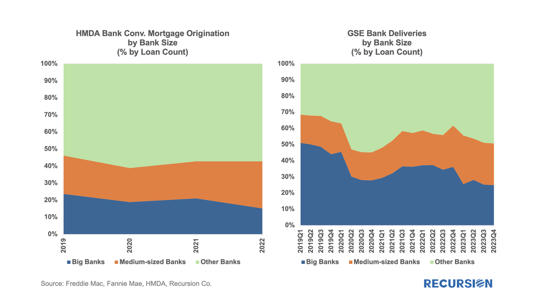 Note that the HMDA data ends in 2022 as 2023 HMDA has not been released yet. In both cases, we see a trend decline in the share of the Big 4 banks. There are a couple of observations that are notable here. First, the share of mortgage activity of the Big 4 institutions with regard to mortgage activity is in decline. (Originations by 9% from 2019 to 2022, deliveries by 22% from 2019 to 2023). It seems that the bulk of declines in the bank share of deliveries in 2023, cited in the earlier note, was concentrated in bigger banks. Below find a table of the share of deliveries of the Big 4 Banks along with the median credit score quarterly since 2021: 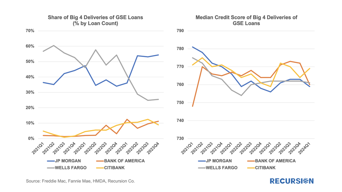 Mortgage Servicing Right (MSR) owners can sell excess servicing fees (ESF) when pricing is supportive or when they need cash. The securitization vehicle for this activity is Agency ESF strips without a Principal-only (PO) component, which are disclosed by Fannie Mae and Freddie Mac. In recent years, issuance of cash strips has been rare, and most strips issued by the GSEs are ESF strips. The following chart shows the amount of ESF securitized each year --- as we can see here Fannie Mae had no activity in such deals in 2020 and 2021 but came back into the market in 2022. To close the gap with Freddie Mac Fannie Mae enhanced its related data disclosures at the beginning of 2023[1]. Fannie Mae’s market position improved from 0% in 2021 to 5.5% in 2022 and to 29.3% in 2023 and 25.8% in the first two months of 2024. 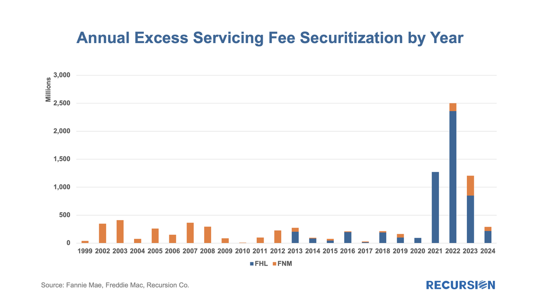 On March 8, 2023, Silicon Valley Bank (SVB) announced a loss of $1.8 billion in a sale of assets and collapsed two days later. The ensuing market turmoil resulted in a string of bank failures and a temporary surge in Federal Reserve lending to the banking sector. What impact has this event had on the mortgage market? To answer this question, we need to be able to distinguish the impact of the SVB collapse from other factors that can impact bank lending. The economy in general and labor markets in particular have posted robust performance statistics over the past year. Mortgage rates, which were about 6.75% in early March last year, surged to a 23-year peak of 7.75% in November and currently stand nearly unchanged from a year ago at about 6.75%.  |
Archives
July 2024
Tags
All
|
 RSS Feed
RECURSION |
|

Copyright © 2022 Recursion, Co. All rights reserved.