|
We kicked off 2024 with a post looking at the sensitivity of low-income borrowers to a slowdown in the economy[1]. We saw continued solid correlations between labor market conditions and jobless claims, particularly for low-income borrowers. At present, these all remain near historically low levels. However, we also saw growing distress in some categories of borrowers with modified loans. It seems that policymakers are going to great lengths to keep homeowners out of foreclosure. This effort falls directly out of the experience of the Global Financial Crisis, where six million households lost their homes while only one-quarter of these regained homeowner status afterwards[2]. This led to a persistent period of slow growth in the decade following the crisis, a situation that policymakers have become determined to avoid. Consequently, when the COVID-19 pandemic hit, policymakers were prepared with a policy of forbearance where households who were impacted by the disease were allowed to defer payments until their economic situation improved. The policy was extraordinarily effective. Unemployment and House Prices in Two Crises 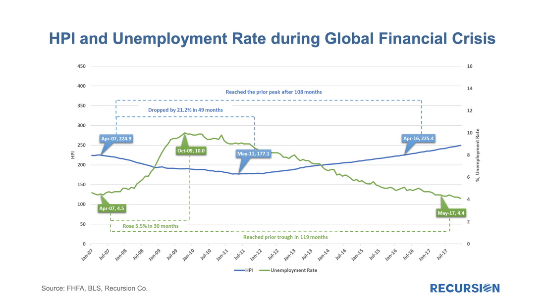 In a recent post, we discussed trends in the ownership of risk in the single family residential real estate market[1]. In this note, we round the picture out with an analysis of the commercial real estate market.  Back in April 2022, we asked the question: The Fed’s Holdings of MBS Holdings Will Decline, Who Will Buy?[1] The release of the Q1 2023 Z.1 data[2] gives us an opportunity to begin to formulate an answer. In fact, the Fed’s share of holdings of MBS peaked at just under a quarter of the market in Q1 2022 (24.4%) and stood at just over one-fifth of the market in 2023Q1 (20.3%). Below find a table breaking this down by major purchaser. 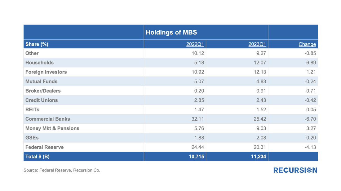 There are two sectors that declined: the Fed and Banks, and two that rose: Money markets and households. There are a few comments below: International Sector The set of international investors in MBS is a complex web of public and private sector participants in developed and emerging markets. They are motivated to invest by a broad range of considerations ranging from short-term returns to currency stabilization. A lot of ink is spilled over these issues, but there is an interesting point to be made that their positions, in aggregate, are motivated to a reasonable first degree by the returns to be found in the market.  Local stories matter, of course. China remains on a long-term path of decelerating growth, bordering on deflation, weighed down by debt and a slump in the real estate sector. The Yuan is near a 15-year low, and further easing measures could lead to additional currency weakness and associated trade tensions. 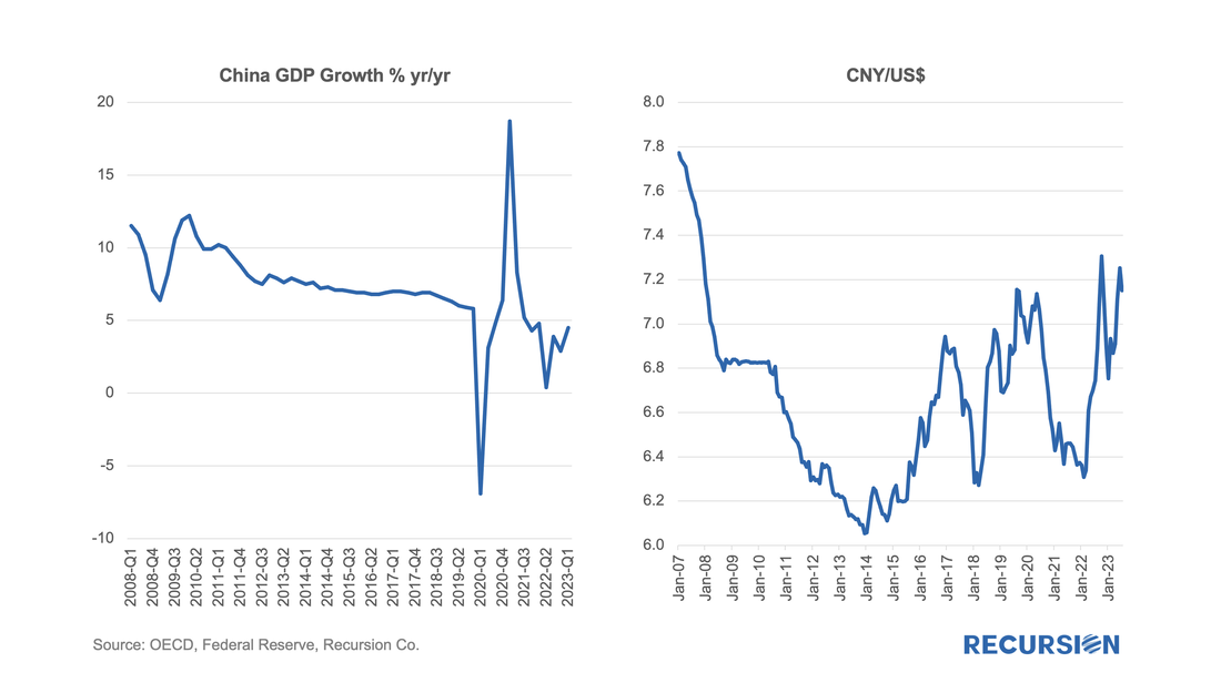 In Japan, the Bank of Japan recently took another step in easing its Yield Curve Control policy that would allow the 10-yr JGB rate to rise. Market concerns are mounting that an acceleration in the yield could lead to widespread adverse market consequences globally, including MBS. 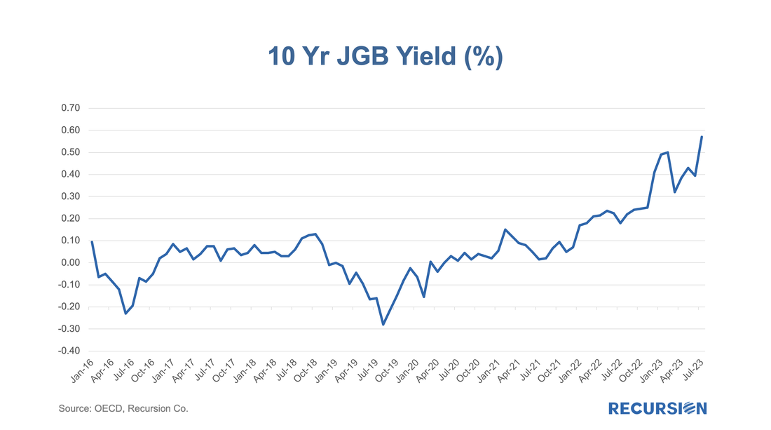 For all this, the share of the international sector rose by just over 1% over the last year. Banks In the previous post, we noted that the shares of bank and Fed holdings are positively correlated. This is because as the Fed sells securities, the funds used by the investors that purchase them often come out of bank deposits. That remains true, but per the table above, the decline in the bank share over the last year exceeded that of the central bank by about 2.6%: 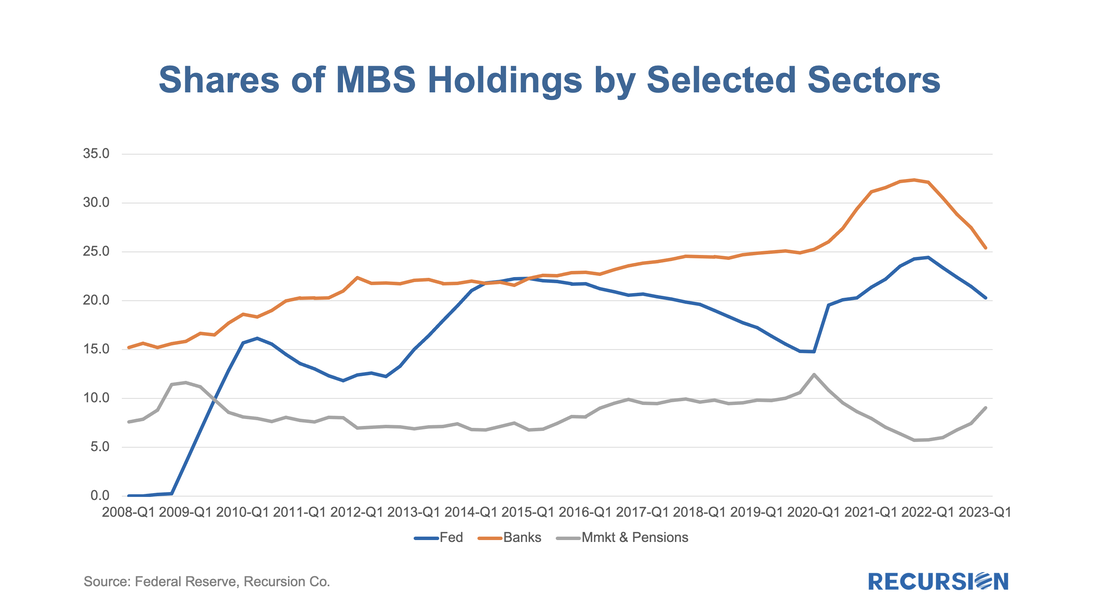 The other factor responsible for the decline in the bank share is higher interest rates which act to draw funds out of depositories into private investment vehicles. Over the past year, the formula “Change in bank share = change in Fed share – change in money market & pension share” is accurate within 1%. Private Investors Most analysts, us included, have been looking for the private sector to pick up its MBS holdings as the Fed steps back. That has in fact occurred, but with an unexpected twist. Below find the shares of holdings over time for mutual funds and households[3]: 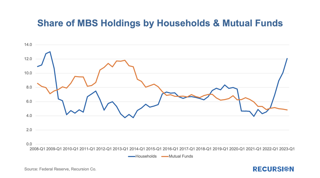 The share of MBS held in mutual funds has declined steadily since 2014, with no evidence yet that higher yields are attracting more funds into this sector. The striking result is a surge in ownership by the household sector, now accounting for over 12% of the total, the highest level attained since the GFC was raging, and the integrity of the banking sector was widely questioned. In June 2022, CPI inflation was reported at 8.9% yr/yr, the highest rate since 1981. Along with ChatGPT and the metaverse, our younger readers can learn a new term: coupon clip. It was all the rage in the early ‘80s, along with “Indiana Jones”. Wait long enough and everything comes back. [1] https://www.recursionco.com/blog/the-feds-holdings-of-mbs-will-decline-who-will-buy
[2] https://www.federalreserve.gov/releases/z1/ [3] “The households and nonprofit organizations sector is the residual holder of agency- and GSE-backed securities.”https://www.federalreserve.gov/apps/fof/SeriesAnalyzer.aspx?s=LM153061705&t=L.101&suf=Q Overview The release of the Financial Accounts of the United States (also known as the Z.1[1]) is always an opportunity to learn about important structural changes in the mortgage market. This is particularly the case in our current environment of high home prices and borrowing costs which we call “mortgage winter”. In this note, we focus on the breakdown on the ownership of risk for single family mortgages. This is not the share of ownership of MBS; it is who bears the credit risk for the loans. Unsurprisingly, the growth in single-family mortgage credit outstanding in Q1 grew by the smallest amount in almost 7 years in the first quarter of 2023: 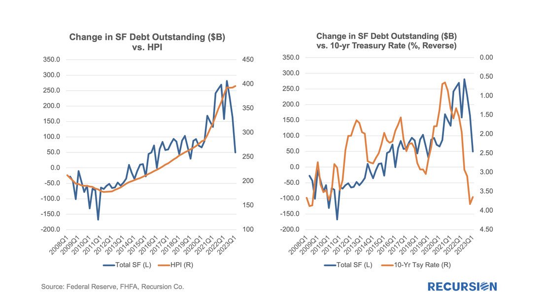 The value of research depends on the consumer. Traders look for actionable ideas to shore up their P/(L), policymakers look for insights into the impact of various regulatory changes, and risk managers look for potholes in the road ahead. The best research informs all of these constituencies by impacting the “big picture” thinking of all of these constituencies. We just got a fine example of the latter from a new paper by Camelia Minoiu of the Atlanta Federal Reserve, and Andres Schneider and Min Wei of the Federal Reserve Board, “Why Does the Yield Curve Predict GDP Growth? The Role of Banks.”[1] An old puzzle in economics is why Treasury Curve yield flattening is an excellent predictor of recessions. The authors conduct a comprehensive investigation into the role of banks in the relationship. A lower term premium, they argue, reduces profitability and the availability of credit. What does this have to do with the mortgage market? Mortgage credit is provided by both banks and nonbanks. Nonbanks, it may be argued, are monoline credit providers whose credit provision is less impacted by this factor. This leads us to the following chart:  It is well known that since June 1, 2022, the Federal Reserve has allowed MBS to mature off its balance sheet without replacement[1]. Consequently, the portfolio has declined, but at a very modest pace since high-interest rates have eliminated most of refinance activities: 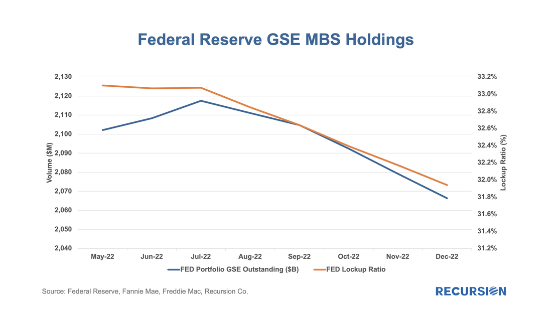 With data in hand for the first half of 2022, it seems a good time to revisit the topic of the share of issuance between the two GSEs. This is also, at least implicitly, a hot topic in policy circles following the announcement on the part of the GSEs that they will be imposing a 50 bp fee on commingled Super and CMO pools starting on July 1[1]. Regular readers of our blog will recall how we pointed out that the Fed purchases of Super pools created an imbalance in favor of Freddie Mac loans that may have been a contributing factor to their rise in market share in 2020 and 2021[2]. Interestingly, the Freddie Mac share of GSE purchase loans has fallen back. As shown in this chart, the FHL share of delivery peaked in August 2021 at 56%, while most recently it stood at 42%. 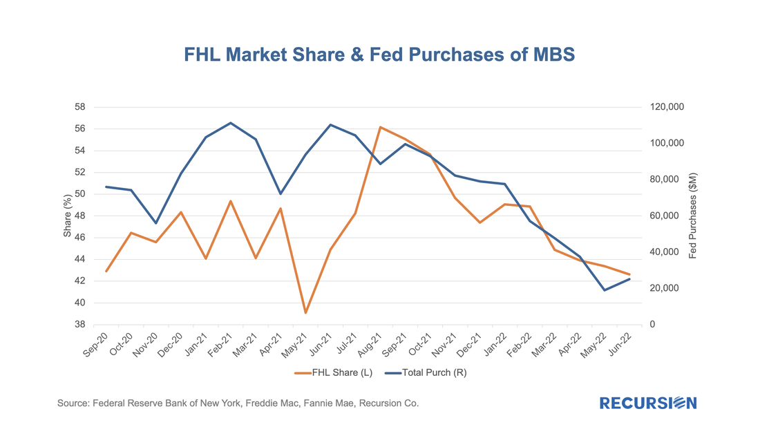 Recently we commented on the potential for various investor market segments to increase their holdings of MBS as the Federal Reserve winds down its portfolio[1]. An interesting category is foreign investors. At the end of 2018, when the Fed initiated its QE program, foreign investors held about 17% of outstanding MBS, and this has fallen to a little less than 12% at present. Most of the decline occurred in the wake of the global financial crisis when mortgage-related securities were revealed to be riskier than generally believed. As noted in that post, there are many considerations facing foreign investors in US securities that do not weigh as heavily on domestic money managers. These include foreign exchange risk, local market conditions, and geopolitical risk. To gain a better understanding of the underlying behavior behind the trends in overseas asset holdings, we turn to another data set, the Treasury International Capital (TIC) data. This data provides balances and transactions of overseas holdings and transactions by country and asset class, including MBS[2]. This note looks at recent developments in this regard for three key Asian economies: China, Japan and Taiwan. The following chart provides a picture of the value of MBS holdings for each of these three countries back to 2012: 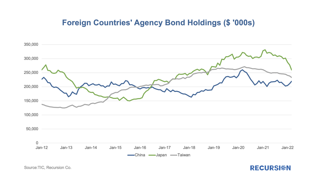 |
Archives
July 2024
Tags
All
|
 RSS Feed
RECURSION |
|

Copyright © 2022 Recursion, Co. All rights reserved.