|
In a recent post, we posed the question: as the Fed’s portfolio shrinks, who will buy[1]? In this report, we dig a bit deeper and look at the differential market impacts based on whether the loans on the balance sheet roll off (as in, for example, a refinance transaction) or are sold off. In the first case, we assume that a mortgage in a pool the Fed holds is extinguished, and a new mortgage is created through a refinance transaction, or via a home sale followed by the purchase of a new home financed by a new purchase mortgage, or through a buyout that generates a new modified loan. This case describes the situation described in the earlier post: a mortgage on the Fed’s balance sheet disappears, and some other investor has to pick up the new loan. The question here is how much higher the yield on the new pools has to be to attract sufficient demand from private investors. These new loans tend to have characteristics that investors find attractive, including a coupon which is near the most liquid part of the market (the current coupon). The second case is quite different. In this instance, the question is how much higher the yield has to be (lower price) for the existing mortgages being sold to find buyers, not for a new mortgage with the most desirable characteristics. In this case, it’s not just a matter of who has the capacity to increase their holdings, but how much additional yield investors will be required for characteristics that are less than pristine. These are challenging issues that we can’t offer precise solutions to, but one way to approach the issue is to see how different the Fed’s portfolio looks from those held in the private sector. To conduct this exercise, we look at two characteristics. The first is the coupon distribution of what the Fed holds vs. the portfolios held by private investors. This rather technical exercise can be conducted by supplementing the data provided in the Agency disclosures contained in our Pool-level Analyzer with the central bank’s holdings provided by the New York Fed[2]. In fact, the distinction is quite notable for 30-year fixed-rate mortgage pools: 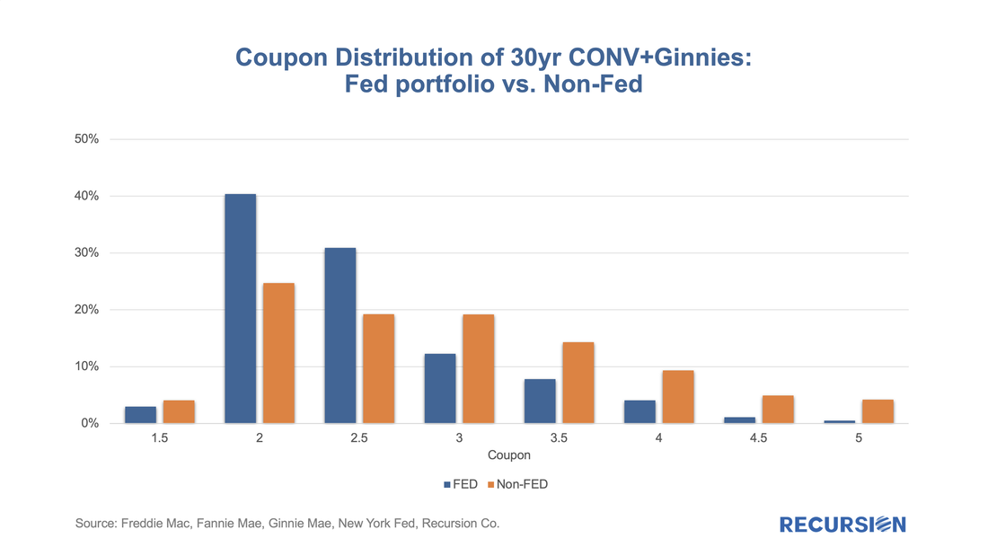 In a recent post[1], we discussed findings obtained with the recent release of 2021 HMDA data. Among other things, we looked at the share of mortgage originations by income group and product type. In this note, we look at the difference in lending patterns between the banks and nonbanks. The incentive behind this approach is policy driven. There is a long history of measures taken to encourage lenders and builders to foster economic development in low-income areas via the housing market. For example, the Community Reinvestment Act (CRA) stipulates that a bank’s performance with regards to compliance of their regulatory requirements depends in part on: “the geographic distribution of loans—that is, the proportion of the bank's total loans made within its assessment area; how these loans are distributed among low-, moderate-, middle-, and upper income locations[2]” To assess this issue, we assign a flag to each of the census tracts designated by HUD as having a greater than 51% share of households with incomes in the Low-to-Moderate (LMI) range in the larger MSA the tract is part of[3], which are called LMI area by HUD, or “low income” tracts by FHFA. Below find a chart of the 10-year trend in the share of loans originated in this category by institution type for conventional and FHA loans: 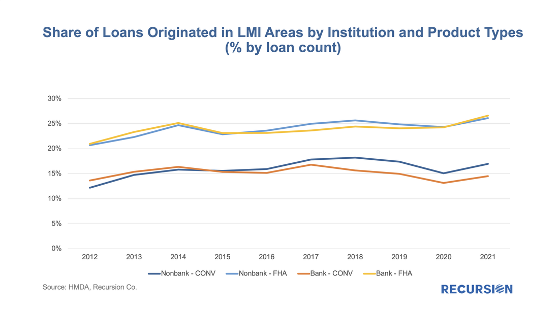 The fourth quarter of 2021 marked the 13th anniversary of the introduction of the Federal Reserve’s Quantitative Easing (QE) policy, whereby the central bank worked to push longer-term rates lower once short-term rates hit the zero lower bound. This activity largely took place via purchases of longer-dated Treasury securities and mortgage-backed securities. There were many nuances as the central bank bought securities in different proportions over time and occasionally let their balance sheet shrink as the securities they held paid off or matured. The purpose of this note is to take a big-picture view of the MBS market impact of a likely decline in Federal Reserve holdings in the Agency space as the central bank has recently indicated its intention to begin letting these securities run off its balance sheet. In particular, the FOMC statement of March 16 stated, “In addition, the Committee expects to begin reducing its holdings of Treasury securities and agency debt and agency mortgage-backed securities at a coming meeting.[1]” Which we guess will be in May. What does this mean to valuations in the MBS market? Our analysis is based on the data collected on Agency MBS ownership broken down by major investor class by the Federal Reserve in the Financial Accounts of the United States[2]. This data is produced quarterly and is a broad measure of Agency securities, including not just single family Agency MBS but also Multifamily MBS and Agency Debt. Below find a chart of the progress of the Agency MBS market from Q4:2008, when the Fed launched QE, through Q4:2021. The chart nicely shows the ebb and flow of activity in this market on the part of the major players. The holdings controlled by the central bank is one example, starting at near-zero in Q4:2008 and cycling up and down, reaching a record high of almost 25% at the end of 2021. 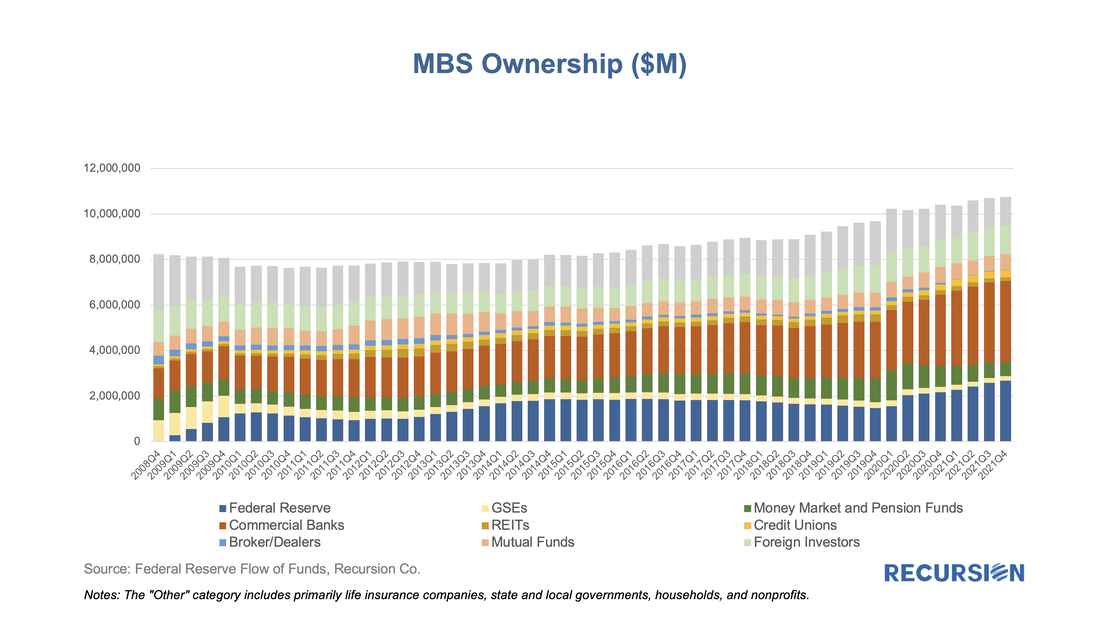 An ongoing theme of these posts has been the way that the Covid-19 pandemic and the policy response it has engendered have served to upend traditional relationships in the system of housing and housing finance. During the Global Financial Crisis, the unemployment rate surged to 10%, and housing prices collapsed by 35% causing widespread devastation in global financial markets. Shortly after the onset of the health crisis, the unemployment rate shot up close to 10% again, but this time, house prices soared, rising over 25% from May 2020 to October 2021. 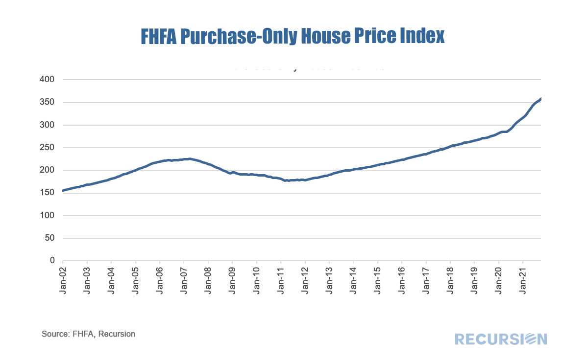 In a recent post[1], we discussed using Recursion’s proprietary tools to unravel the Federal Reserve’s MBS holdings of Fannie Mae and Freddie Mac loans. The Fed’s holdings, however, are part of a bigger picture issue regarding the notion of “float” in the MBS market, that is, the amount of securities outstanding that are available to trade. The holdings of the central bank serve to reduce the float as the Fed is a buy-and-hold investor. These loans are said to be “locked up”. Besides the Fed, loans can be locked up in structured products, notably Collateralized Mortgage Obligations (CMOs). The first CMOs were launched by Freddie Mac as Real Estate Mortgage Investment Conduits (REMICs) in 1988 and allow cash flows to be tranched to meet the needs of different investors[2]. Pools in CMOs’ collateral groups are also locked up. 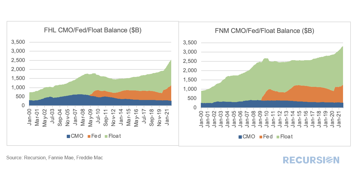 To read the full article, please send an email to [email protected] With talk of taper at the top of the monetary policy discussion, it is worthwhile to dig a bit into the role of the Federal Reserve in the functioning of the MBS market. As is well known, the onset of the Covid-19 pandemic resulted in a resurgence of central bank purchases of Agency mortgage-backed securities (MBS). Chart 1 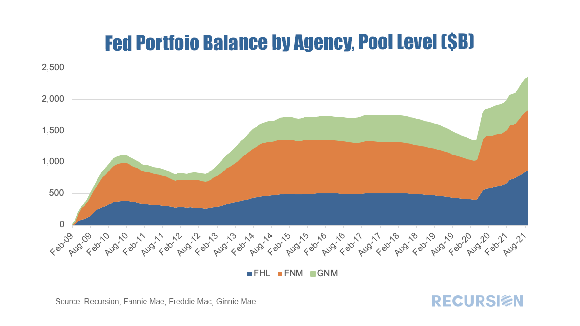 Recently, researchers at the Federal Reserve published a blog about trends in first time home buyers (FTHB)[1]. They utilize a dataset that is a 5% sample of credit files from a credit bureau. It appears from their analysis that there was a bit fewer than 5 million loans originated in 2020, so it would seem they are using a sample of around 250,000 loans. It is natural to ask how their measure of first-time home ownership compares with our calculation using Agency loan level delivery data consisting of over 4 million loans for that year. To start, we can look at the trend of purchase mortgage delivery for the past seven years: 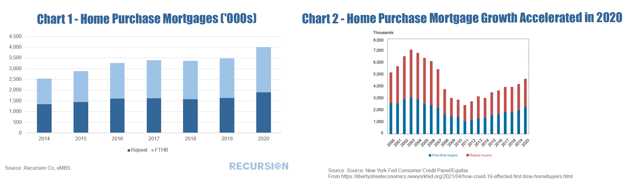 And second, we can compare estimates of first-time homeownership: 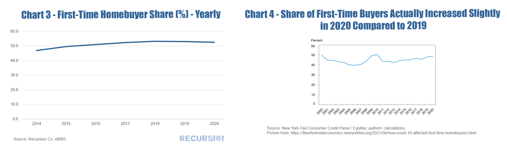 There are several distinctions to be made between the two data sets that are worth pointing out. First, the loan level delivery data only goes back through 2014 on an annual basis. Second, the Agency delivery data does not include loans originated but held on investor balance sheets, including any non-QM loans. A third difference is that the Fed researchers consider FTHB to be the first-ever mortgage file for a household while the Agencies consider a household to be “first-time” if they have not owned a house in more than three years. The number of loans delivered to the Agencies in 2020 increased by considerably more (15.1%) in Chart 1 than that from the credit bureau (10.5%) in Chart 2, which does not reflect a difference in the growth in the total number of loans originated, but rather an increase in the share of originated loans delivered to the Agencies. During Covid, investors preferred to hold mortgages with insured credit risk. This can be seen in the sharp decline seen in the “not sold” category from the recent 2020 release of HMDA data. 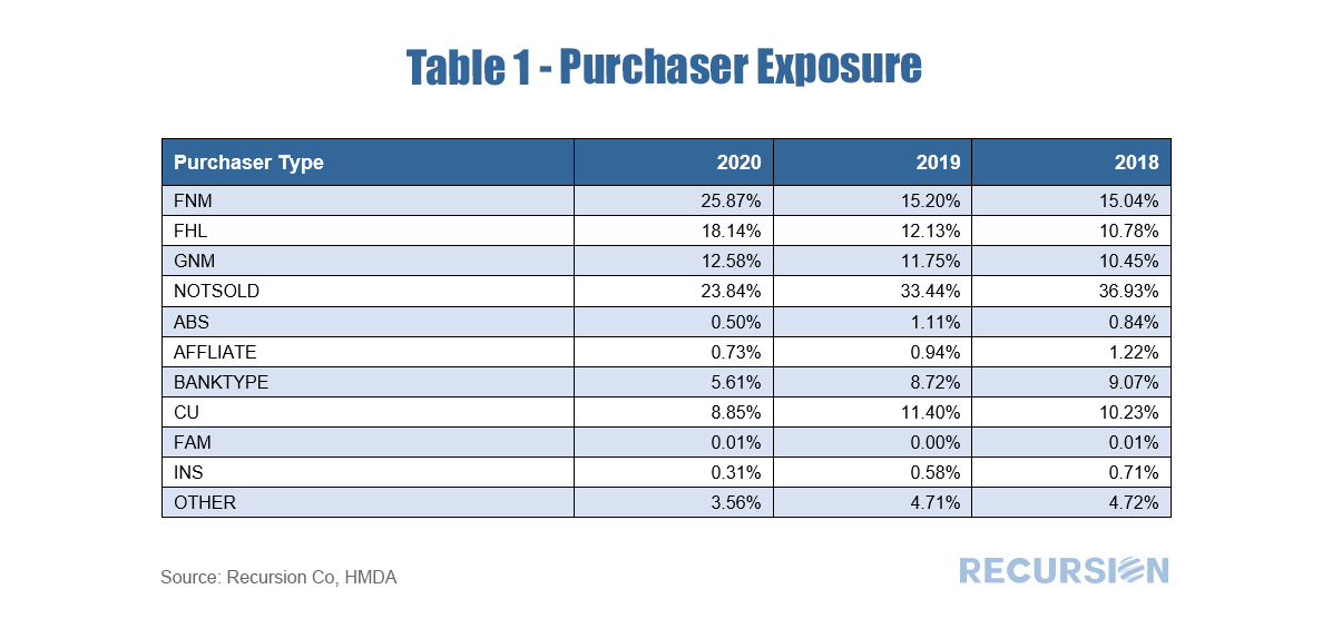 The share of FTHB in our data is slightly higher than in the Fed report, which may be due to a low FTHB share in segments such as Jumbos and non-QM loans not included in our datasets. But a key difference is that our FTHB share declined slightly in 2020 from the prior year (52.5% from 53.1%) while it rose slightly in the Credit Bureau data (48.8% from 48.2%). A rigorous attribution of the difference is beyond the scope of this note, but a few comments based on the composition of our delivery data can be made. First, in our data, the decline in the first-time homebuyer share can be attributed to a rise in the market share of conforming loans with lower FTHB shares at the expense of GNM loans with higher FTHB shares[2]. Second, our data comes in monthly so we can look a bit at the dynamics within the year: 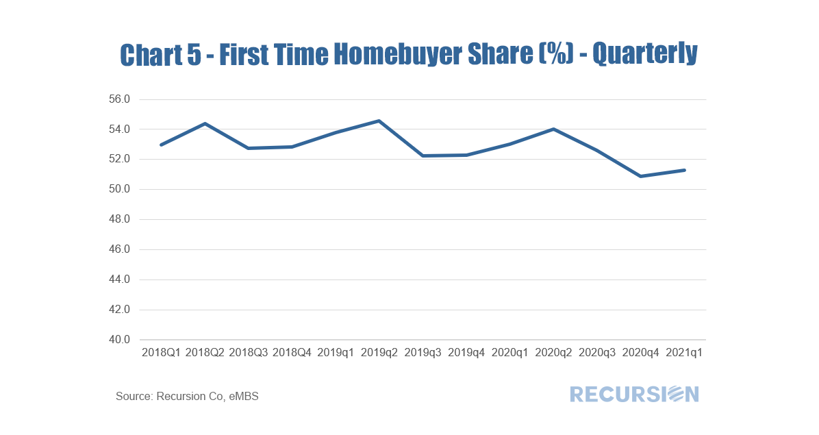 Interestingly, we show the FTHB share picked up in a normal seasonal pattern in 2020 Q2 and Q3, when the pandemic hit with full force. However, in Q4 the share declined to pre-pandemic levels, and rebounded only slightly in the first half of this year. It will be very interesting to monitor these trends going forward. The role of the Federal Reserve in the mortgage market is an ongoing theme in this blog, dating back to the early days of the Covid-19 crisis[1]. Besides the level of short-term rates, when we think about the Fed, we consider its direct intervention through the outright purchases of MBS. A common view of this “QE” policy can be seen in charts such as: 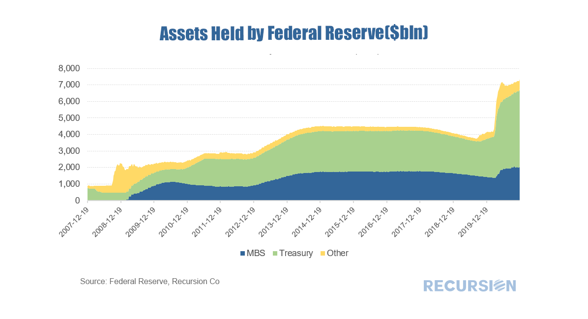 |
Archives
July 2024
Tags
All
|
 RSS Feed
RECURSION |
|

Copyright © 2022 Recursion, Co. All rights reserved.