|
Over the past six months, prepayment speeds of Ginnie Mae securities have notably widened against those of the GSEs. 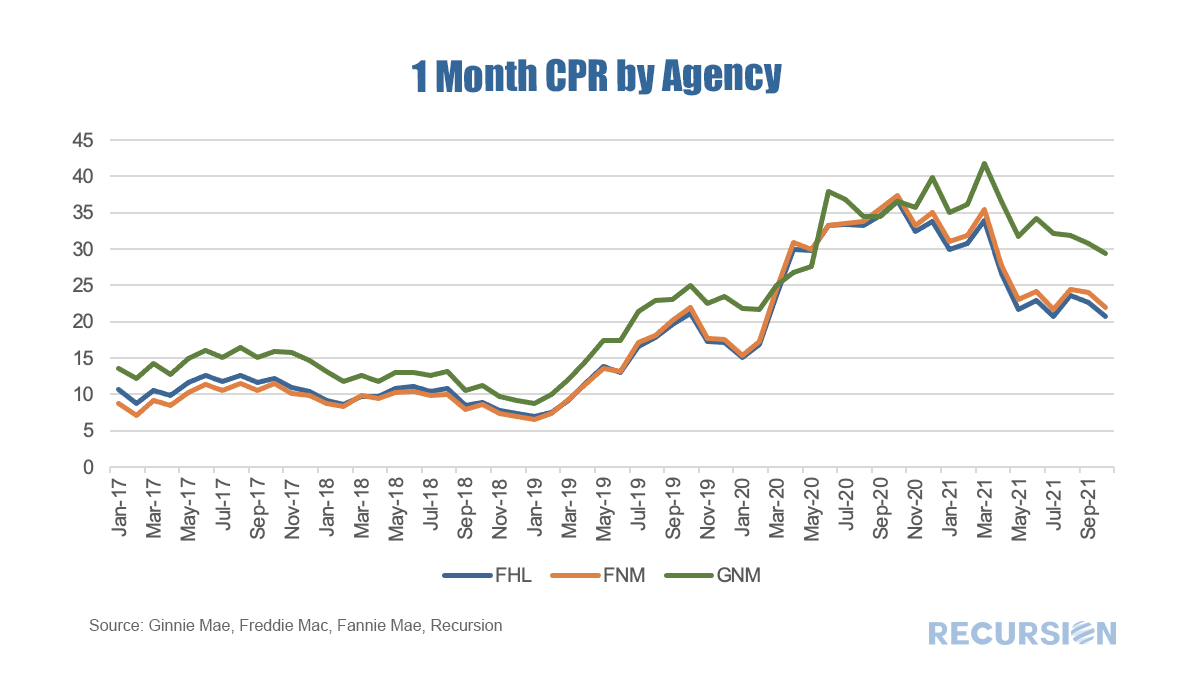 In a recent post[1], we looked at the share of the use of the cash window for bank and nonbank sellers. We found a reversal in the long-term upward trend in this share this year, correlated with the imposition of FHFA imposed lender-level caps on the use of the cash window. We next turn to performance. We look below at prepayment speeds for the 2018, 2019 and 2020 cohorts broken down by bank and nonbank sellers. 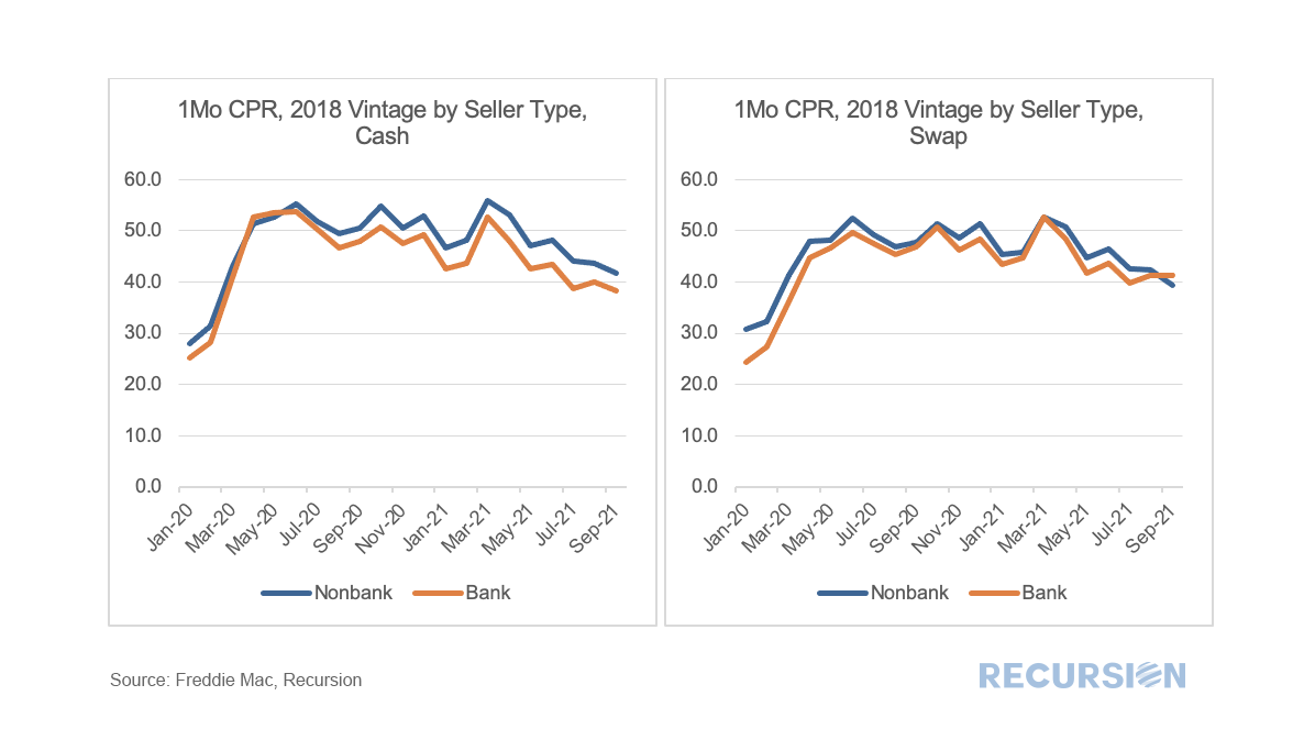 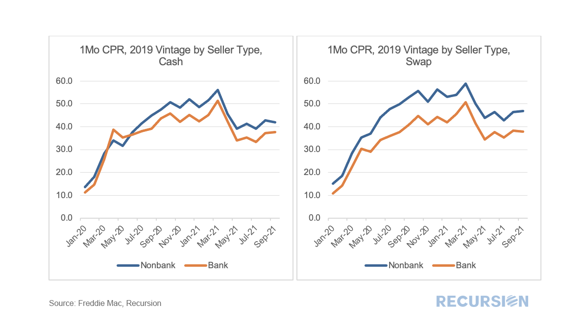 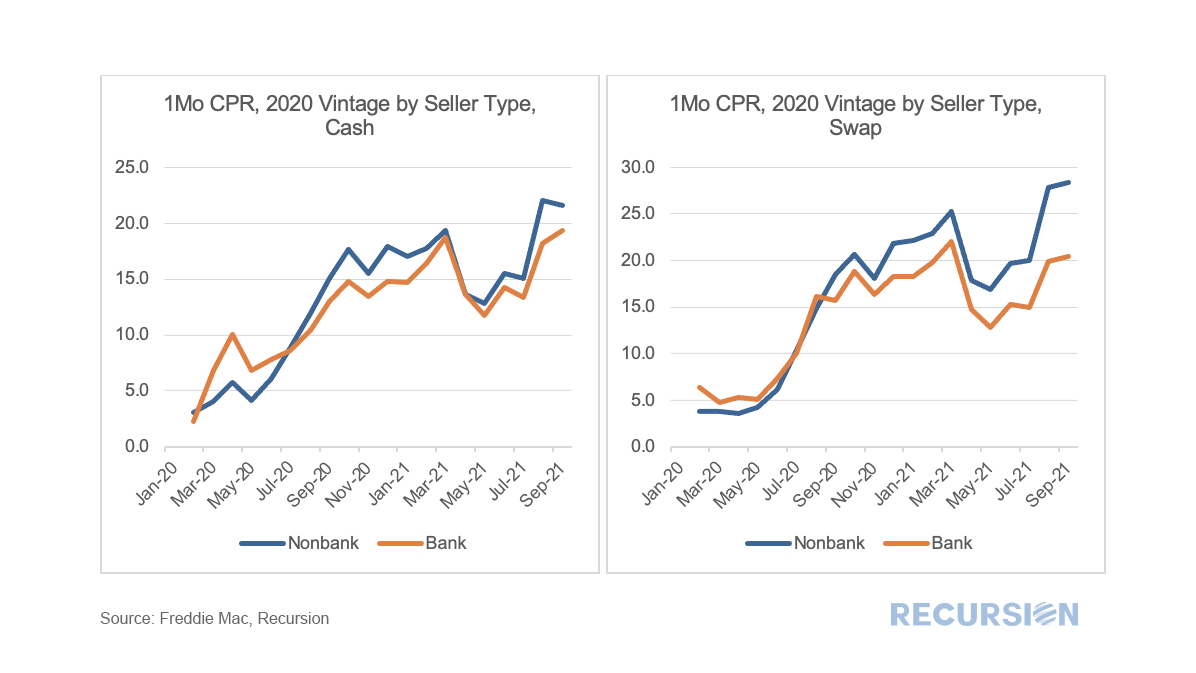 As we approach year-end and the beginning of the process of phasing out forbearance programs, the natural question market participants are asking is which indicators should they be watching to gain a sense of the mortgage landscape in 2022. Along these lines, there is a significant difference between the Ginnie Mae programs and the GSE’s. In particular, for conforming loans, it is the Agencies themselves that buy nonperforming loans out of pools, while for FHA and VA, this function is performed by servicers. As the timeframe for buyouts on the part of the GSE’s was extended to 24 months earlier this year, we won’t see much activity prior to April 2022 on this front[1]. So in this post, we focus on the Ginnie Mae programs. As we have written previously, it is challenging to follow the path of a loan once it has been purchased out of a pool. At the aggregate level, we can view the activity of individual lenders using the FHA Neighborhood Watch data[2]. In terms of the process, a nonperforming loan is bought out of a pool, and one of three actions can be taken. First, the borrower can be taken into foreclosure. Second, the borrower can become current and roll the unpaid balance into a second lien, in a process known as a partial claim. Third, the borrower can accept a loan modification. In terms of the scale of buyouts, after an early spurt of activity in 2020 on the part of some parties, notably banks, the involuntary prepayment rate, measured by CDR(constant default rate), has settled down in recent months. FHA nonbank servicers have been more active in this space than other categories over the past year. As forbearance plans begin to expire towards the end of the year, these numbers may start to rise. 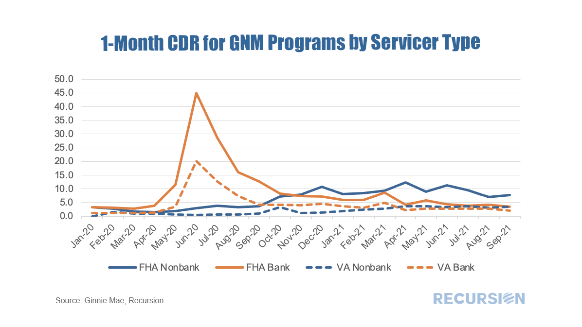 It’s always interesting to look at the underlying dynamics within the mortgage market to get a deeper handle on the forces behind recent trends and to gain insights into the market impact of policy changes. This time we will look at a breakdown of the market between the cash window and swaps. Simply, in a swaps transaction the lender sends loans to one of the Enterprises, Fannie Mae or Freddie Mac, and in return obtains a security which it can keep as an investment (mostly in the case of banks) or else sell into the market (both banks and nonbanks). The alternative is to sell the loans directly to the Agencies for cash. This is important to nonbanks in particular as this cash is used as a funding source for running their businesses. As it turns out, neither GSE reports the path by which a loan is obtained in their loan-level disclosures. However, in the case of Freddie Mac, cash loans are placed in their own pools with distinct prefixes. As a result we can unpack these pools and perform a matching exercise with the loan tape and assign these accordingly. This allows us to perform queries on this characteristic across our loan-level querying tool Cohort Analyzer. Below find the share of deliveries made to Freddie Mac from the Cash Window by loan purpose. 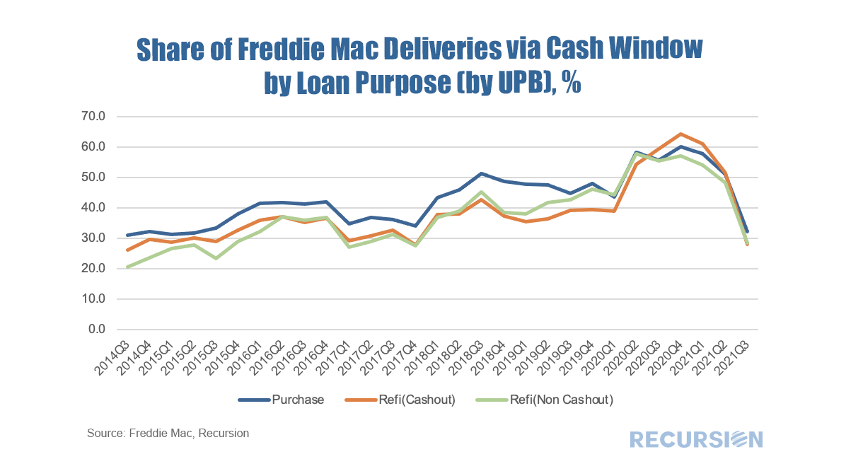 Credit provision is one of the great areas of concern addressed by the New Housing Policy. In a previous post[1], we mentioned that we have integrated HUD LMI Neighborhood information with our tools. We can view aggregate credit creation through Cohort Analyzer, and its composition through HMDA Analyzer. 2020 marked an unprecedented year for mortgage production as the pandemic sparked aggressive moves by the Federal Reserve driving mortgage rates to record lows, coupled with a flight of households away from density towards more sparsely populated areas. Trends in the major programs by loan count can be seen here: 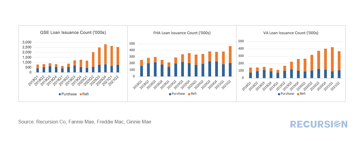 *This chart can be duplicated using the above two queries
The matched dataset continues to pay dividends (sorry no buy-backs). This time we take a look at appraisal waivers. The very straightforward question based on the new data is to ask if there are differences in the rate of PIW take-up among eligible loans between areas with a higher share of low to moderate income people and those with a lower share. Our breakpoint is areas with LMI>=51(Low-or Moderate-Income Areas) and LMI<51 (Not Low-or Moderate-Income Areas), and we look here at just purchase loans. Before we begin, as this query is focused entirely on GSE loans, we felt it necessary to put the bots into overdrive to improve the match rate between HMDA and the GSE loan tapes and for those keeping track the updated match rate is: 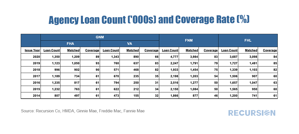 As we accumulate more data at a fine local level, the opportunities to evaluate policies derived from insights into lender, borrower and supervisor behavior grow massively. Our recent post looking at the potential impact of FHFA’s new rate mod policy[1] is our most recent example of the application of digital tools in the policy space, but as noted previously[2], the new policy framework is designed to focus on wealth creation and housing sustainability at the local level. To look at this issue, we need to have data at hand that tells us which local areas have a preponderance of low-income borrowers on which we can overlay the HMDA data set, which reports census tract level indicators related to the policy issue at hand. It turns out that the income data can be found in the American Community Survey (ACS)[3]. A key facet of this survey is information regarding the share of every census tract where low and moderate income (LMI) people comprise less than or equal to 51% of the total population. This data is available through the HUD Exchange[4]. With that, we now have a robust tool for analysis. An immediate challenge in this regard is to come up with specific queries out of the myriad of possibilities that demonstrate their power. Below finds a chart that provides a big-picture view of lender behavior in LMI neighborhoods broken down between banks and nonbanks[5]. Specifically, we look at the trend in purchases from third-party originators of both FHA and conventional loans: 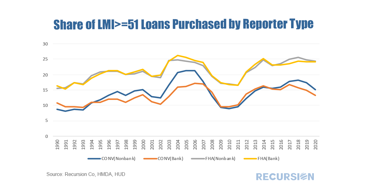 We received the first loan-level performance data for the GSE’s a few months ago, so it’s about time to see what tentative observations can be drawn from this new data set. As a popular theme for this blog is the bank/nonbank share this seems a good place to start. In general, we have noticed that nonbank DQ’s tend to be higher than those for banks, and that this distinction is correlated with the relatively more generous credit terms available in the nonbank sector. Below find a table that demonstrates this for 2018 and 2019 vintage mortgages: 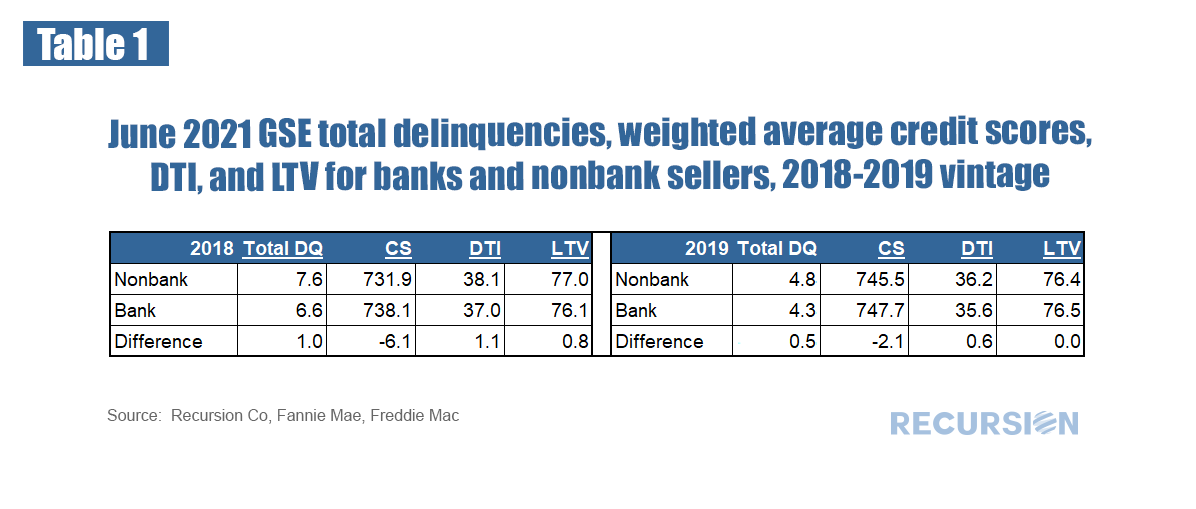 This can be summarized: 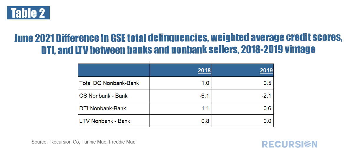 |
Archives
February 2024
Tags
All
|
 RSS Feed
RECURSION |
|

Copyright © 2022 Recursion, Co. All rights reserved.