|
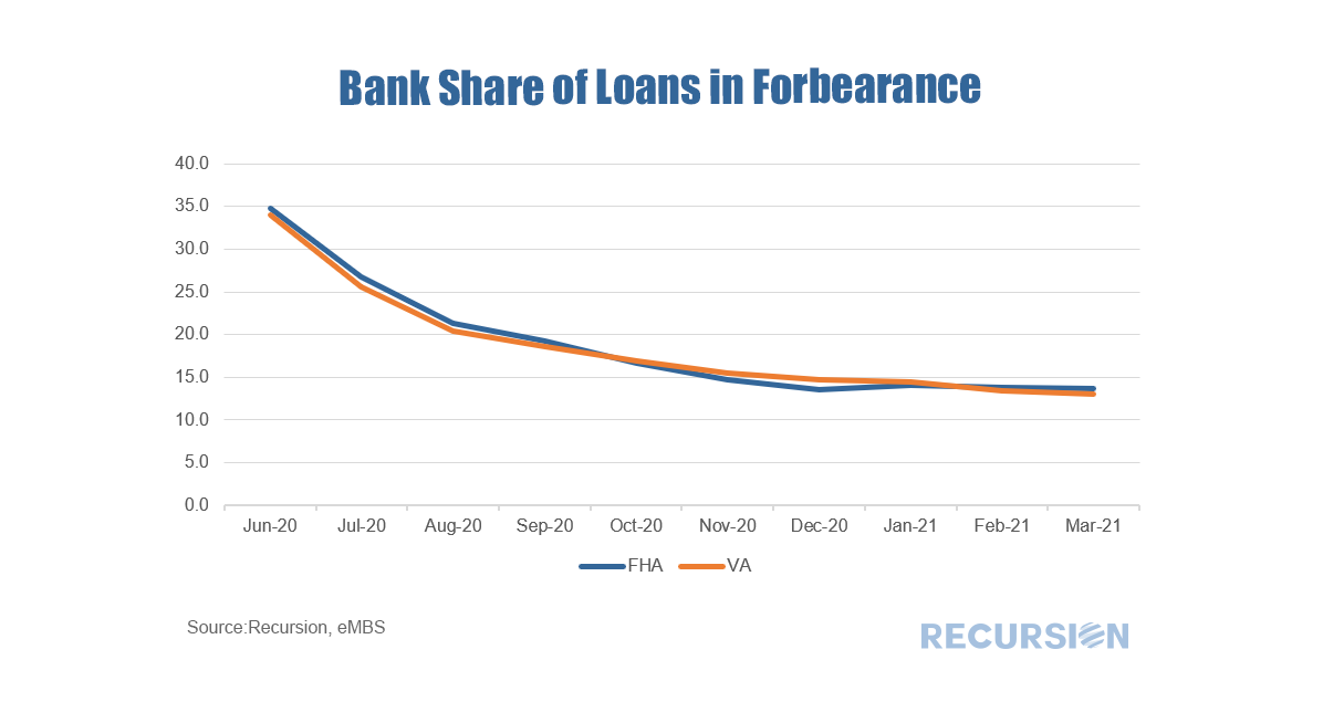
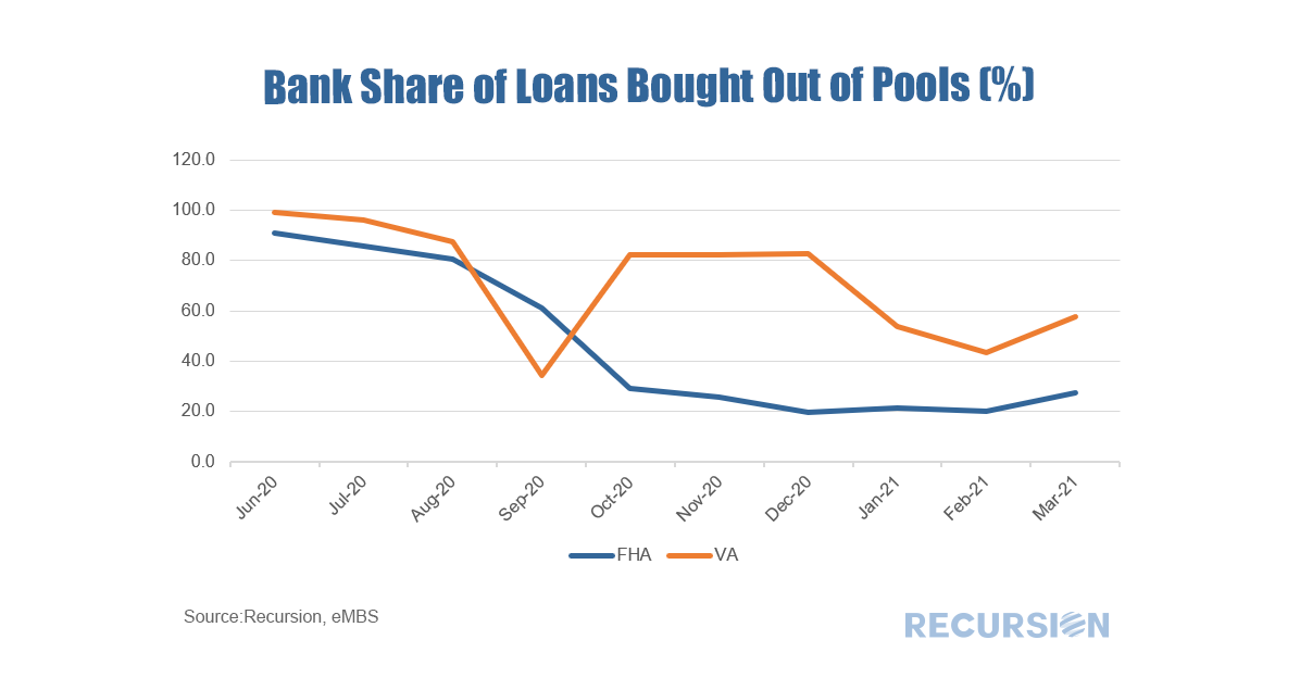
In a recent post, we commented on the drop in the number of loans in forbearance in Ginnie Mae pools[1]. Because of the different capital strictures, it’s interesting to look at the breakdown between banks and nonbanks. Which is a remarkably smooth pattern for a mortgage chart. The question arises as to the factors behind the decline. Recalling that this analysis covers loans in securitized pools, the number may decline either because the loan cures, or because servicers buy them out of pools. To get a sense of the distinction, below is a chart of buyouts by lender type: Here we see some diversity in the pattern. For FHA loans, the bank share of buyouts looks very similar to the share in forbearance implying the decline is mostly cures. For VA the pattern is a bit different, with the bank share of buyouts higher than that for FHA over the past six months. More insight can be gained by digging into this at the individual servicer level. Changes in the buyout pattern for VA programs appears to be related to the behavior of individual firms. For example, the steep drop of the bank share in VA programs in September 2020 is largely due to a sharp increase in loan buyouts by the Navy Federal Credit Union. More analysis at the servicer level is needed for a more complete analysis. |
Archives
July 2024
Tags
All
|
RECURSION |
|
Copyright © 2022 Recursion, Co. All rights reserved.


 RSS Feed
